Logo Design, Branding Ideas & Inspiration for Coaches and Therapists
If you're a therapist, coach, or service-based entrepreneur looking for logo design and branding inspiration, you're in the right place. This post features 25+ real examples of brands created for women in the therapy, wellness, coaching, and mental health space.
At Sundai Studio, I specialize in brand design and web design for coaches, therapists, and service providers. With over 13 years in the design industry and 7+ years working in the wellness space, I help clients build brands that truly embody their energy. As a one-on-one service provider, you are the face of your brand. So it’s my belief that capturing your energy in your visual brand is one of the best things we can do for your business. Why does it matter if a brand feels like you? Because authenticity builds trust. And people that trust you, become paying clients.
“85% have purchased from a brand because it felt authentic, 62% recommend authentic brands, and 70% are willing to pay more for brands they perceive as real.” - Business Wire
And if your current brand is okayyy, but slightly missing the mark… the good news is that a rebrand signifies authority and commitment to the work you do:
“72% of consumers believe a logo redesign reflects a brand's commitment to innovation and continuous improvement.” -StudyFinds
So whether you’re building your first brand or planning a refresh, the stats and data are on your side. 👍
Now let’s dive into the branding and logo design inspiration! ✨
(PS - No AI was used in the creation of these brands! Everything was conceived, hand drawn and illustrated by me!).
Organic, earthy logo designs and brand inspiration:
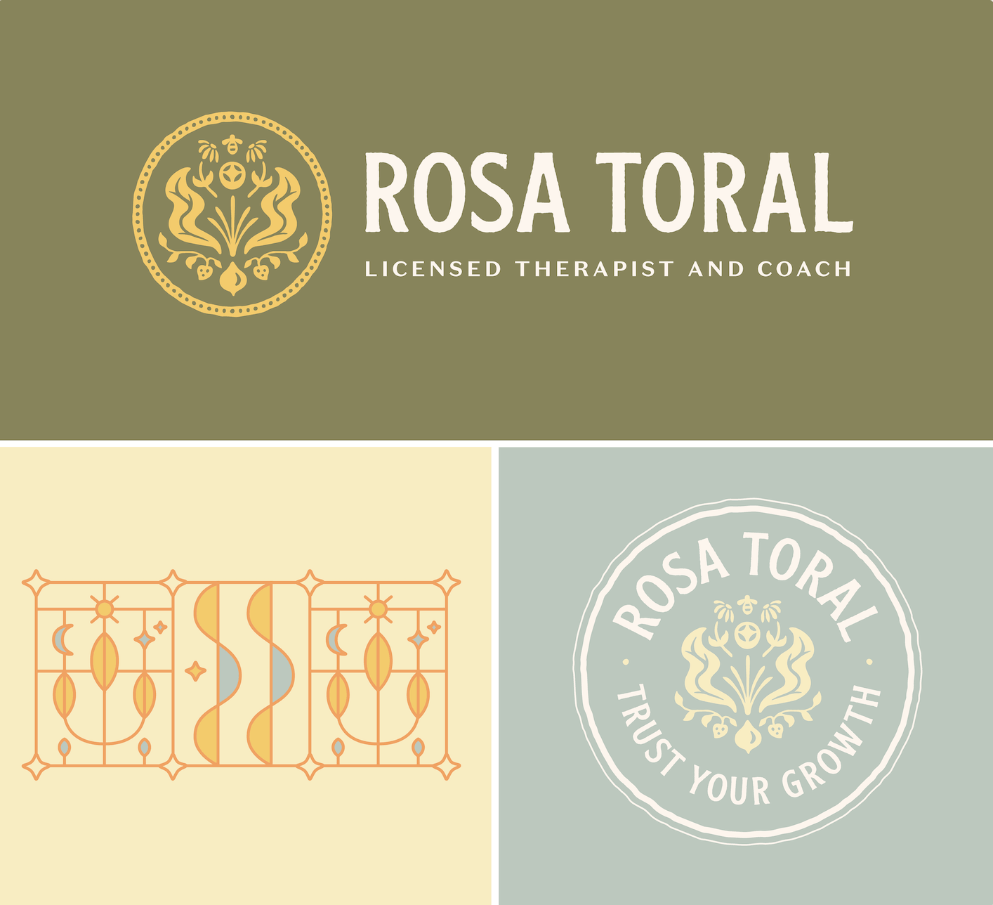
Rosa Toral - Licensed Therapist and Coach
About the Business: Rosa is a licensed therapist and coach based out of Sonoma County, California. Her approach includes aspects of lifestyle, nutrition, movement, and nature-based practices, recognizing how closely our mental and physical well-being are connected. She’s committed to helping people bring awareness to the patterns shaping their lives, helping them navigate change and build lives that feel grounded, intentional and aligned.
Logo and Brand Design Style Notes: Rosa’s brand is earthy and tactile, with rougher hand-drawn edges around the fonts and linework. It feels hand-drawn, and connected to the earth. With a lover of gardening and located in a northern California farming region, her brand deeply reflects the cyclical, seasonal nature of deep growth and healing.
Jennifer Friedman - Physician, counselor & medical trauma speaker
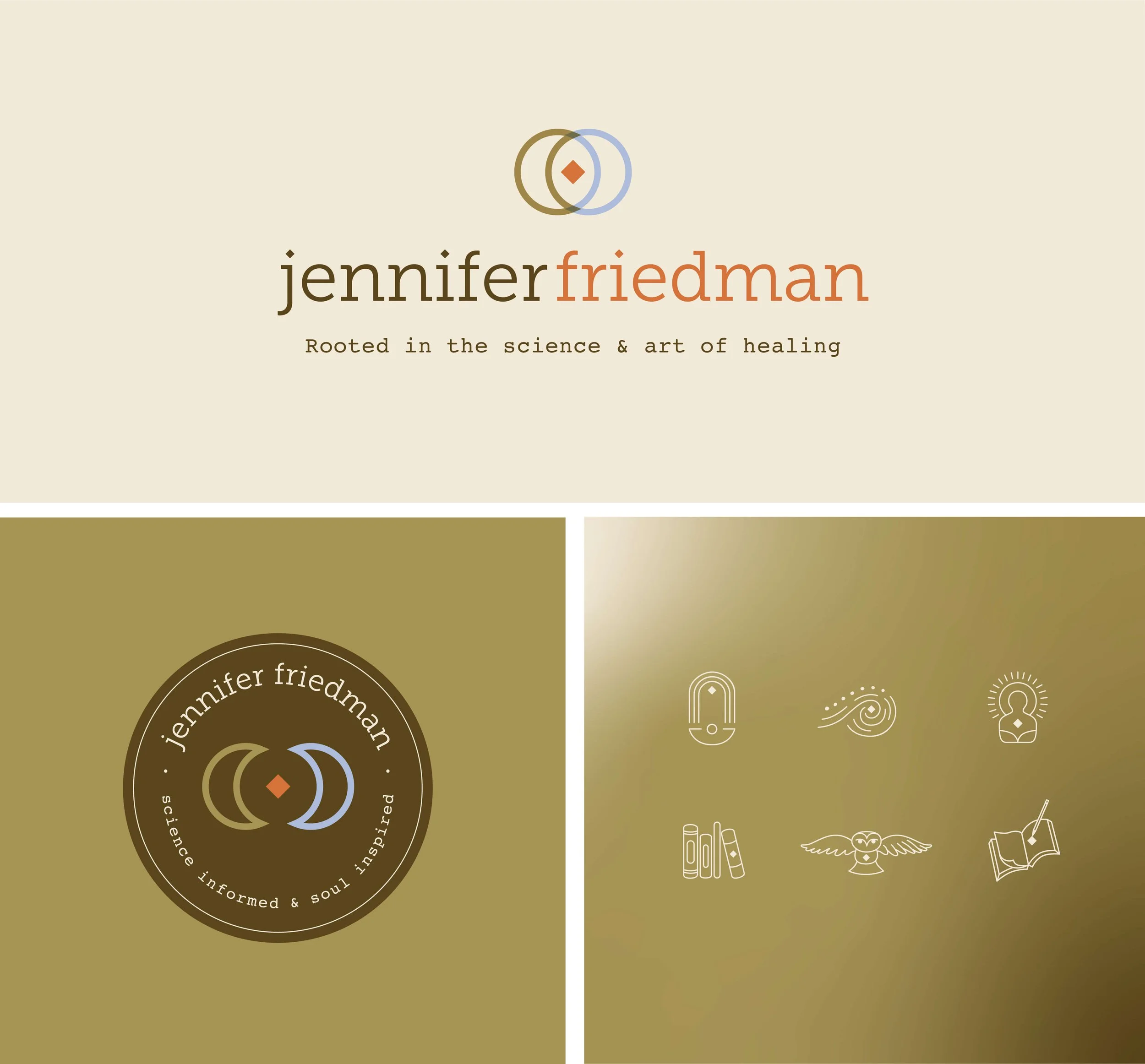
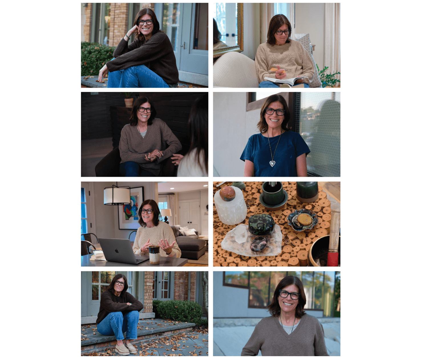
About the Business: Jennifer is based in Chicago, and she guides women and practitioners toward holistic healing. She has studied and taught different forms of healing and has a unique understanding of the mind-body connection, emotions, energy, and medicine. Her work is rooted in both the art and science of healing.
Logo and Brand Design Style Notes: Jennifer is personally drawn to a 60s / 70s color palette and so we drew from those colors and graphics when creating her brand. She is deeply academic, intuitive and warm. Jennifer believes true healing lives in the overlap of art and science. The orange diamond within the submark graphic represents the value and overlap of “Art” and “Science”. The diamond shape became a motif for the brand (can you spot it within the brand icons as well?).
Growth at the Speed of Safety - Breathwork Facilitator
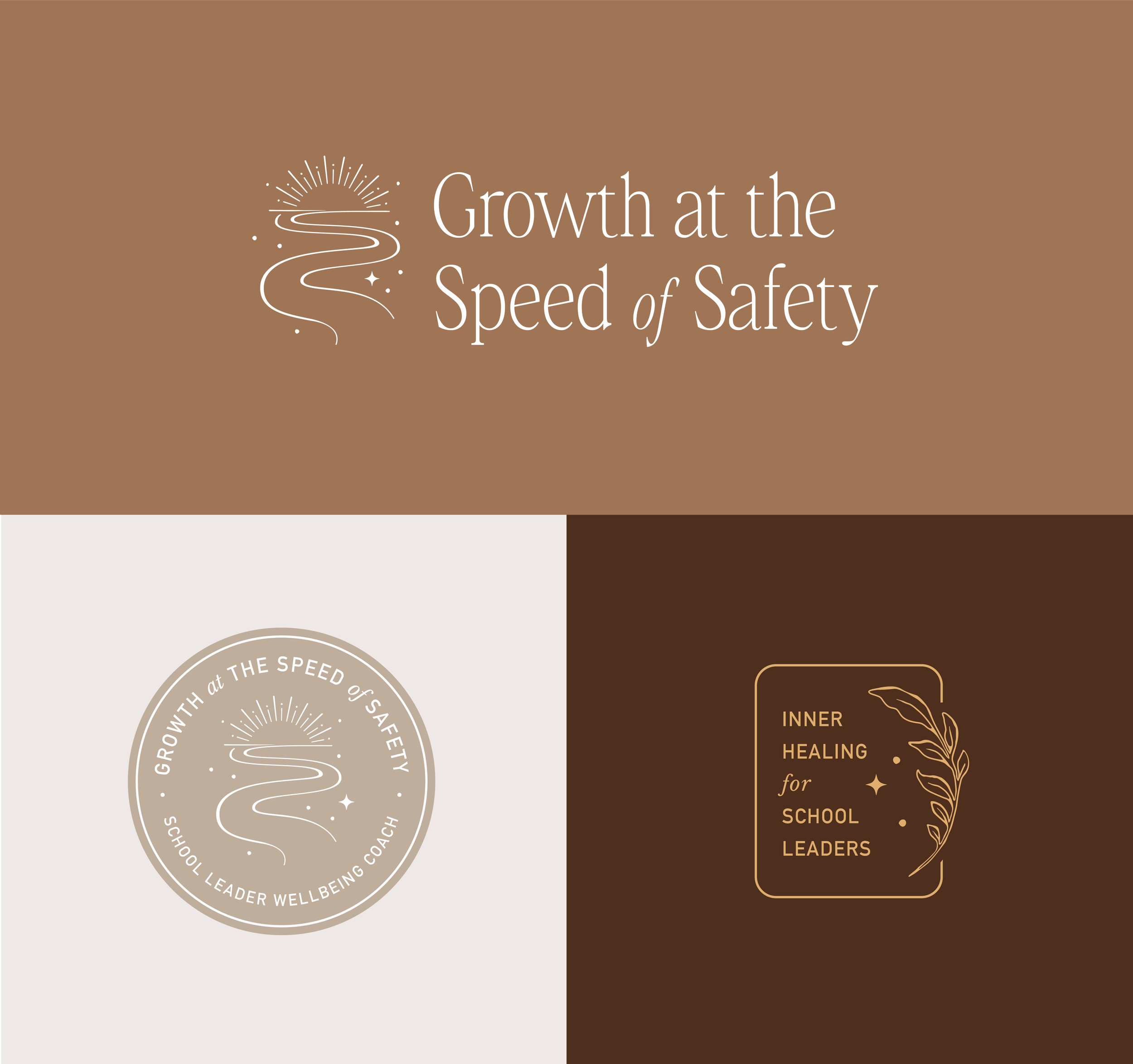
About the Business: Bernice is a trauma-informed school leadership and wellness coach, and the founder of Growth at the Speed of Safety. With over 20 years as a credentialed teacher and administrator in California, Bernice has dedicated her career to fostering inclusive, human-centered learning environments. She offers personal coaching, virtual and in-person workshops, and breathwork experiences.
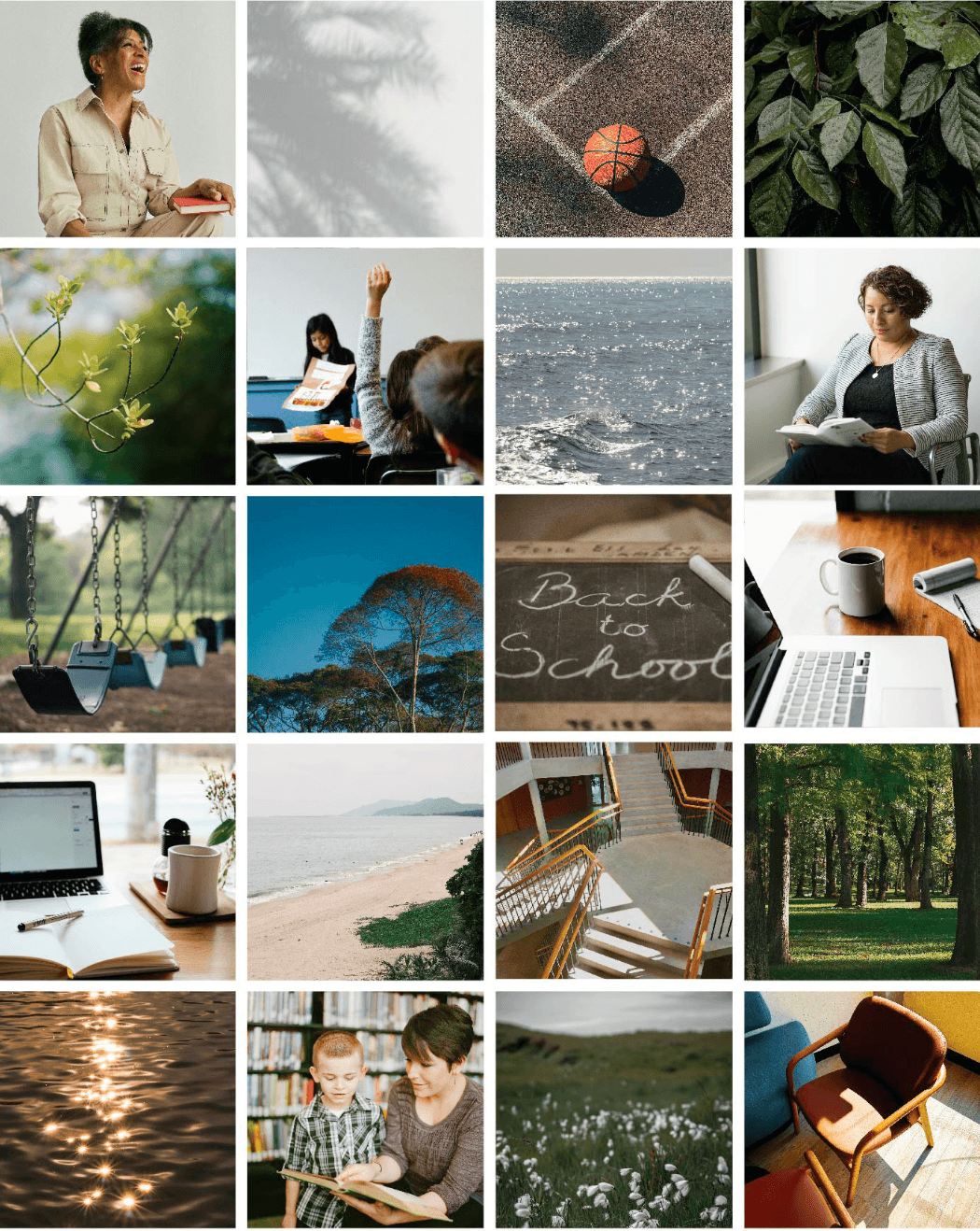
Logo and Brand Design Style Notes: The logo design and branding uses earthy brown color tones and nature-inspired photography—trees, water, greenery—to create a grounded, nurturing atmosphere. Her primary image mark (the main icon) includes a light and airy winding road with sprinkles of stars and light for an overall positive, hopeful feeling.
Ingrid Camacho - Licensed Therapist and Coach
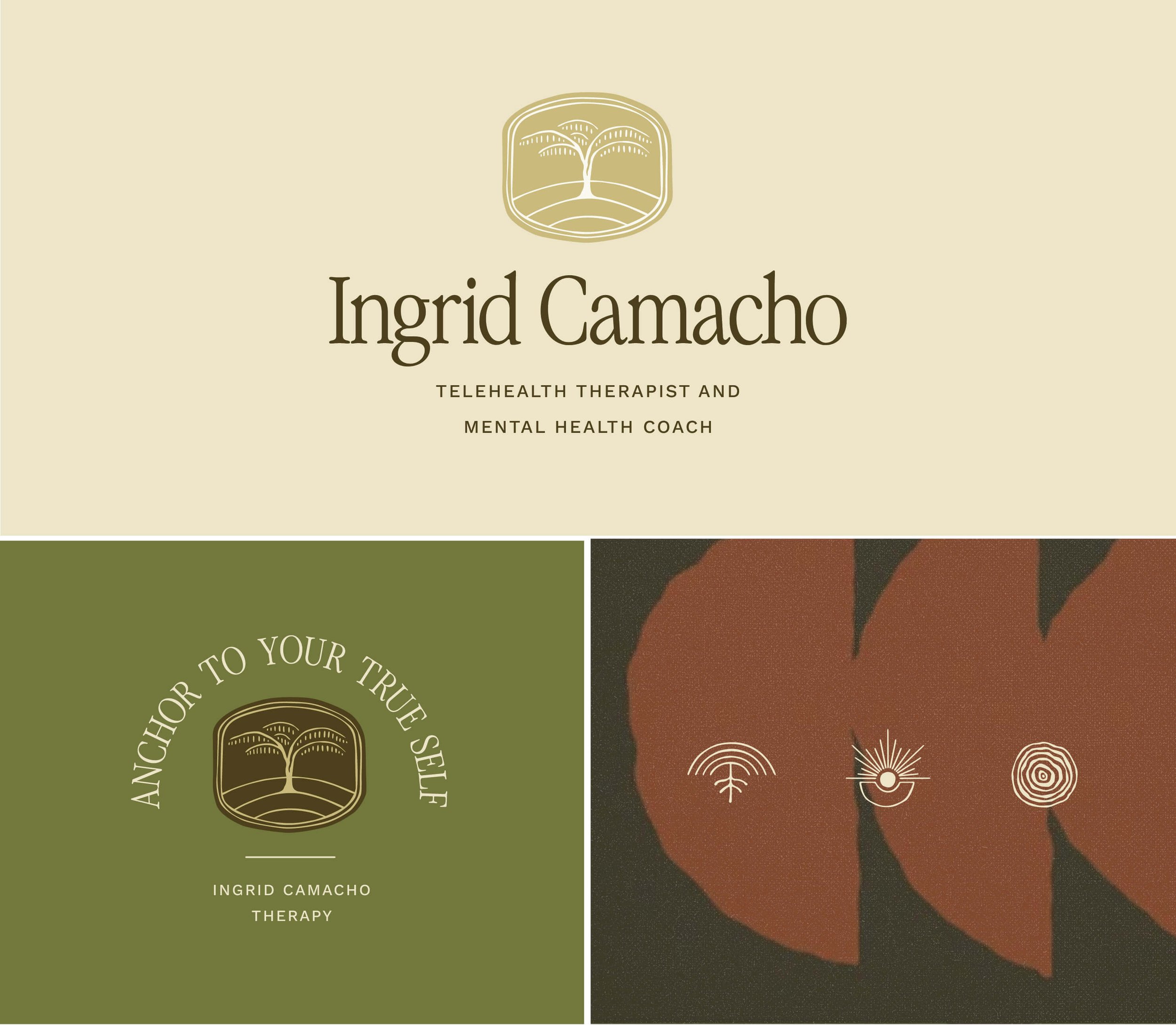
About the business: Ingrid is a licensed therapist serving New York state residents, who helps people looking to break family cycles and build healthier, more intentional relationships. By working with Ingrid, you’ll learn to communicate more openly, set healthier boundaries, and create relationships that feel safe, honest, and connected.
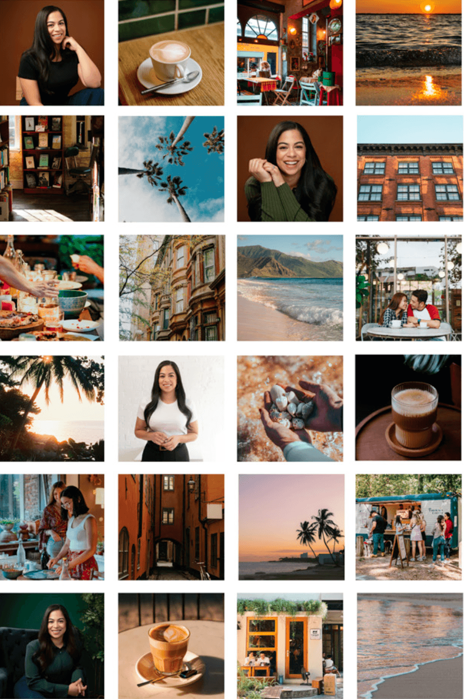
Logo and Brand Design Style Notes: The brand feels grounded, earthy and is deeply inspired by her youth and travels to Puerto Rico. The tree that was illustrated is a replica of a bright red flamboyant tree; a symbol of strength, resilience and a symbol that connects Ingrid to her childhood.
Monica Sale - Nutritional Therapy Practitioner
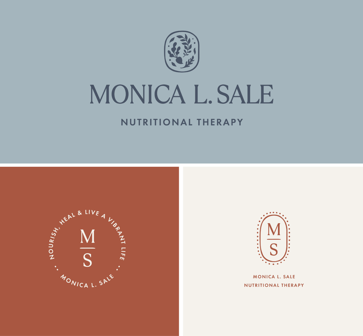
About the Business: Monica L. Sale is a Nutritional Therapy Practitioner (NTP), FLAG Certified Coach and retired Board Certified Medical-Surgical Nurse. She’s passionate about food and lifestyle being medicine in achieving your health and wellness goals. Whether you need a single coaching session or full 1:1 support, Monica can help you optimize nutrition, digestion, stress, sleep, and blood sugar for optimal health and wellness.
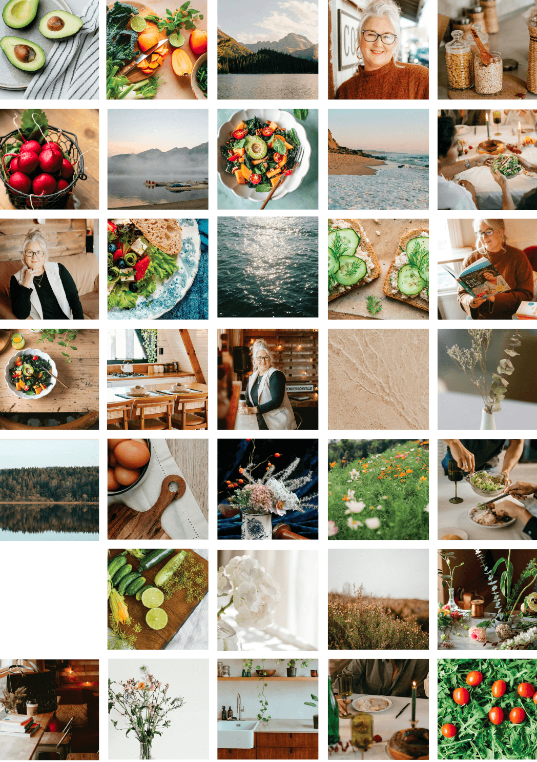
Logo and Brand Design Style Notes: Monica’s color palette includes earthy tones, terracotta and deep blues, and natural photography give the brand a grounded feel. The main illustration is a bounty of fresh herbs and vegetables, inspiring her community to select vibrant healthy choices.
Classic, curated, minimal logo designs and brand inspiration:
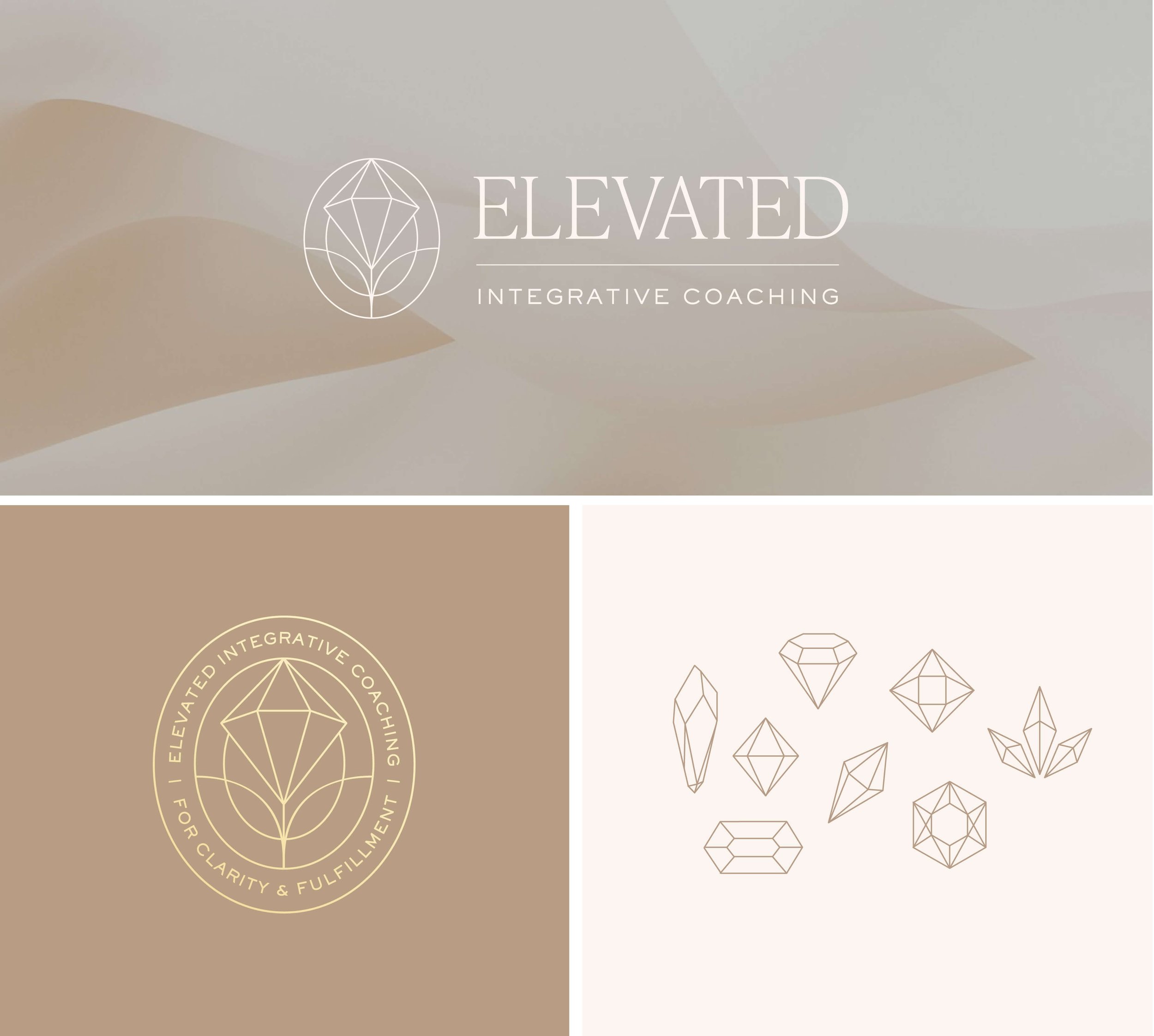
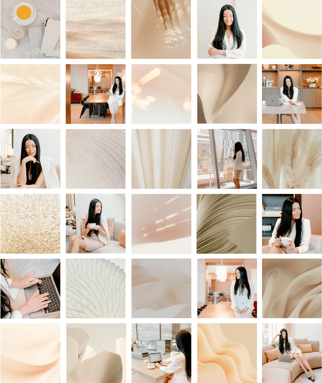
Natalia Popova - Elevated Integrative Coaching
About the Business: Natalia is a licensed therapist who created a separate business for a coaching practice, based out of New York City. She works with high performing individuals, high achievers and business owners.
Logo and Brand Design Style Notes: Natalia’s brand is intended to feel premium, so we incorporated a range of neutral tones, black, and gold accents throughout the brand. For her primary image mark we illustrated a diamond rising above the horizon line. The icon is inside an oval shape using thin delicate lines for a premium feel.
Website coming soon!
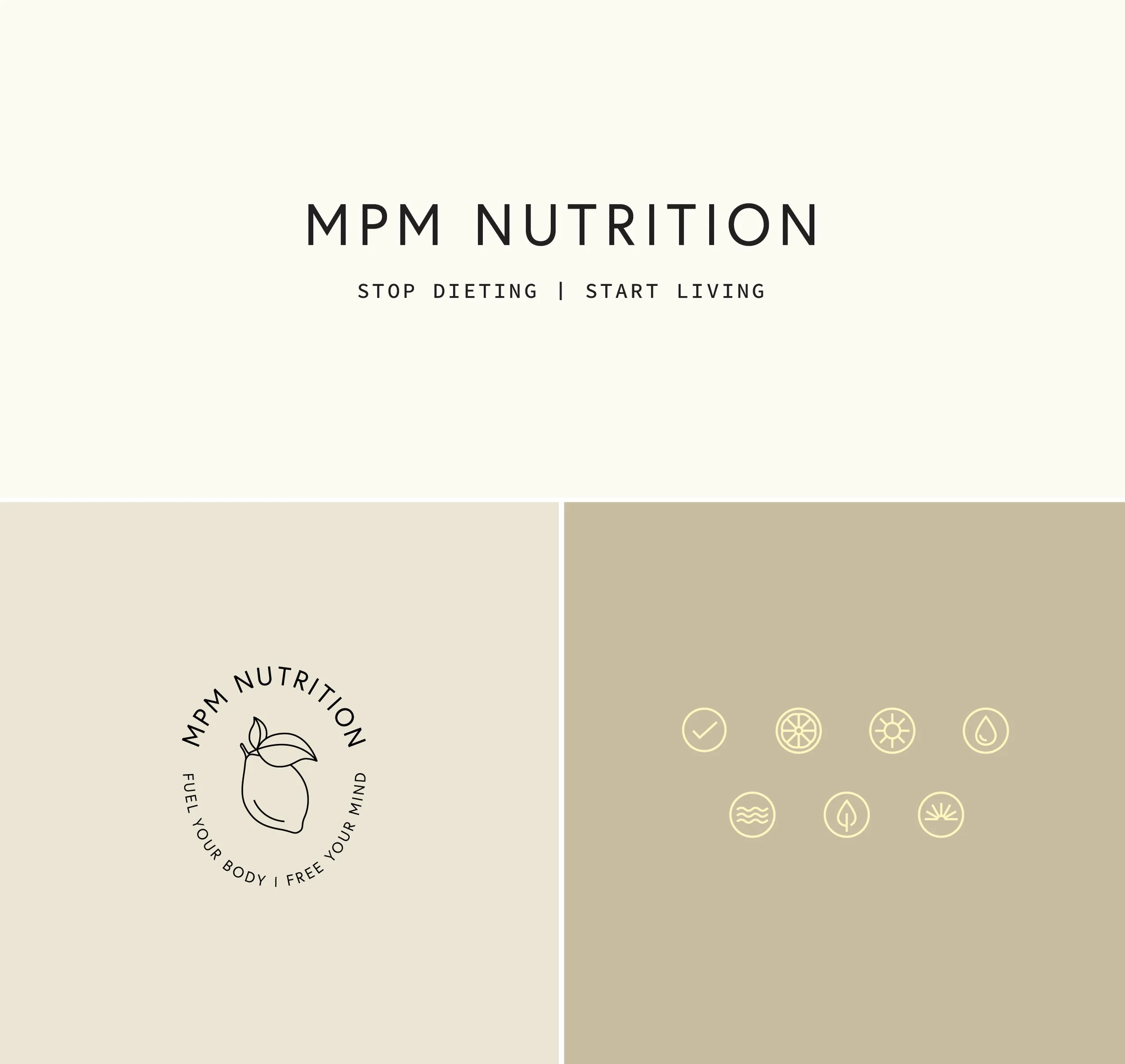
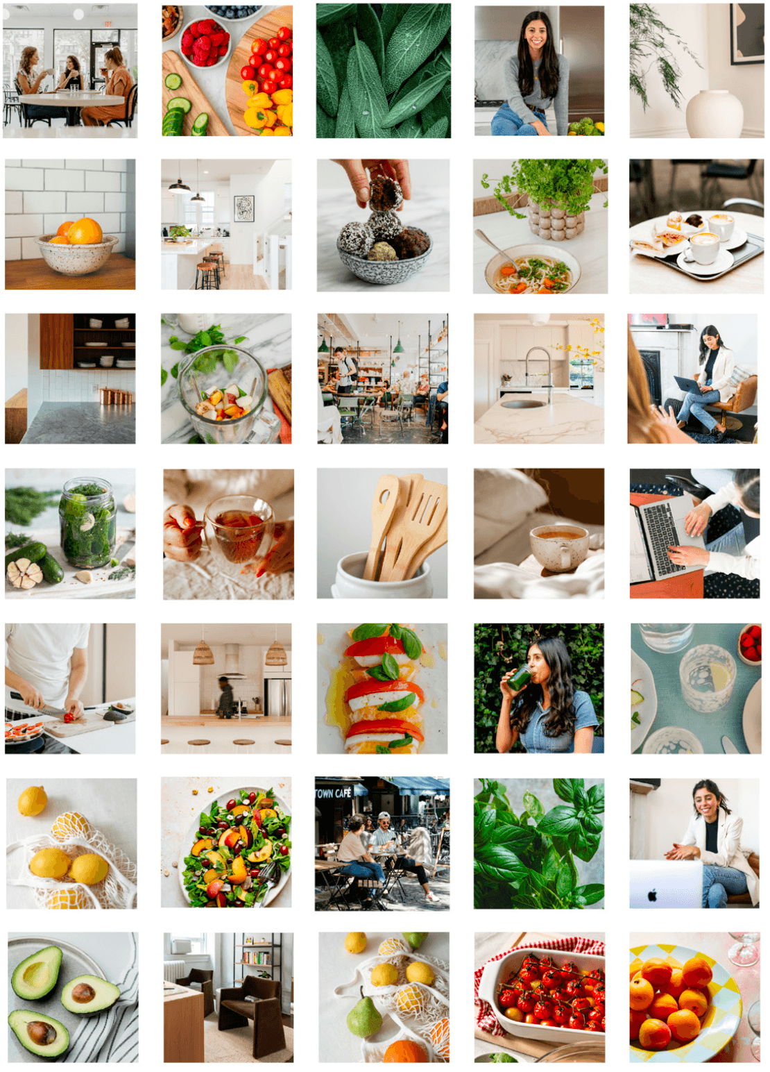
MPM Nutrition - Team of Registered Dietitians
About the Business: Meet MPM —A team of trusted registered dietitians and wellness experts based out of NYC. The MPM team takes a personalized approach to nutrition counseling—getting to know each client’s full story so they can support their journey forward with clarity and compassion. Marissa, the founder, is trained in Mindfulness-Based Eating Awareness Training (MB-EAT), and as a team they emphasize a mindful, sustainable relationship with food.
Logo and Brand Design Style Notes: This minimal, high-end brand features delicate typography, neutral colors, and a signature butter yellow that adds warmth and polish. The result feels premium yet approachable. The lemon, a key brand symbol, has been used since the business was first created years ago so we wanted to keep the concept, just illustrate it in a more modern way.
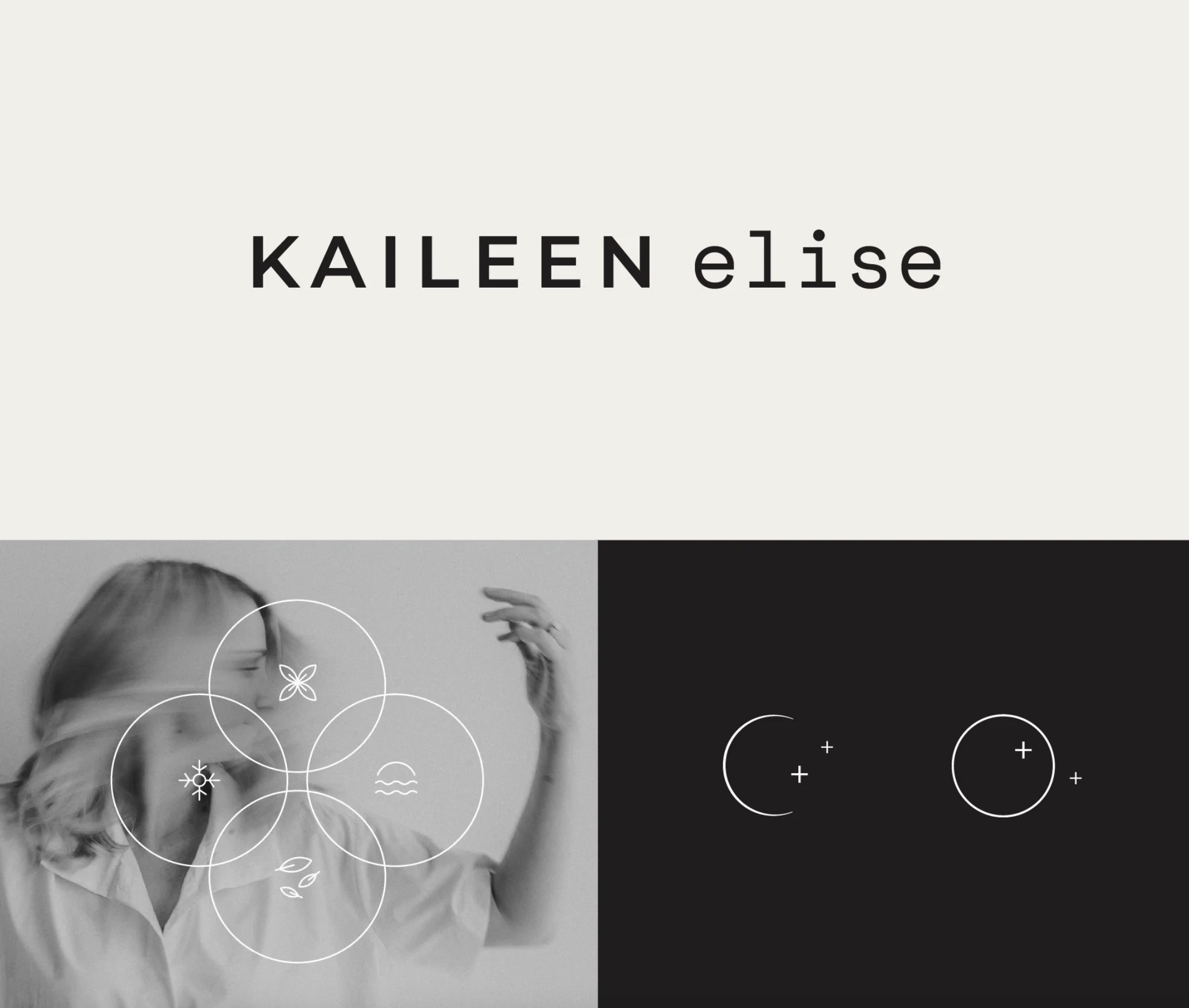
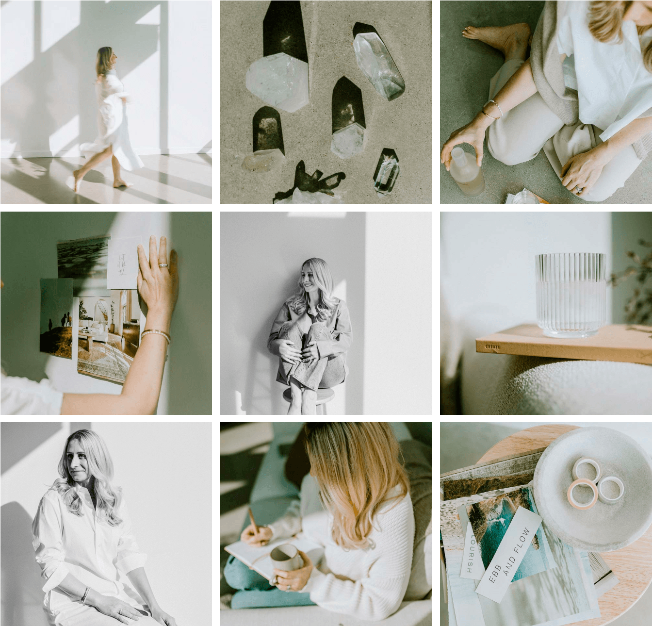
Kaileen Elise - Intuition Coach & Podcaster
About the Business: Kaileen guides high-achieving, woo-leaning women to their inner calm (without the goal setting and action plans they’re used to.). Through Intuition Coaching, she helps clear emotional blocks, integrate past lives, and access intuitive guidance in everyday life.
Logo and Brand Design Style Notes: Kaileen’s brand feels modern with its high-contrast black-and-white palette accented by neon highlighter tones and electric blue. Dreamy, expressive photography adds a personal and elevated touch.
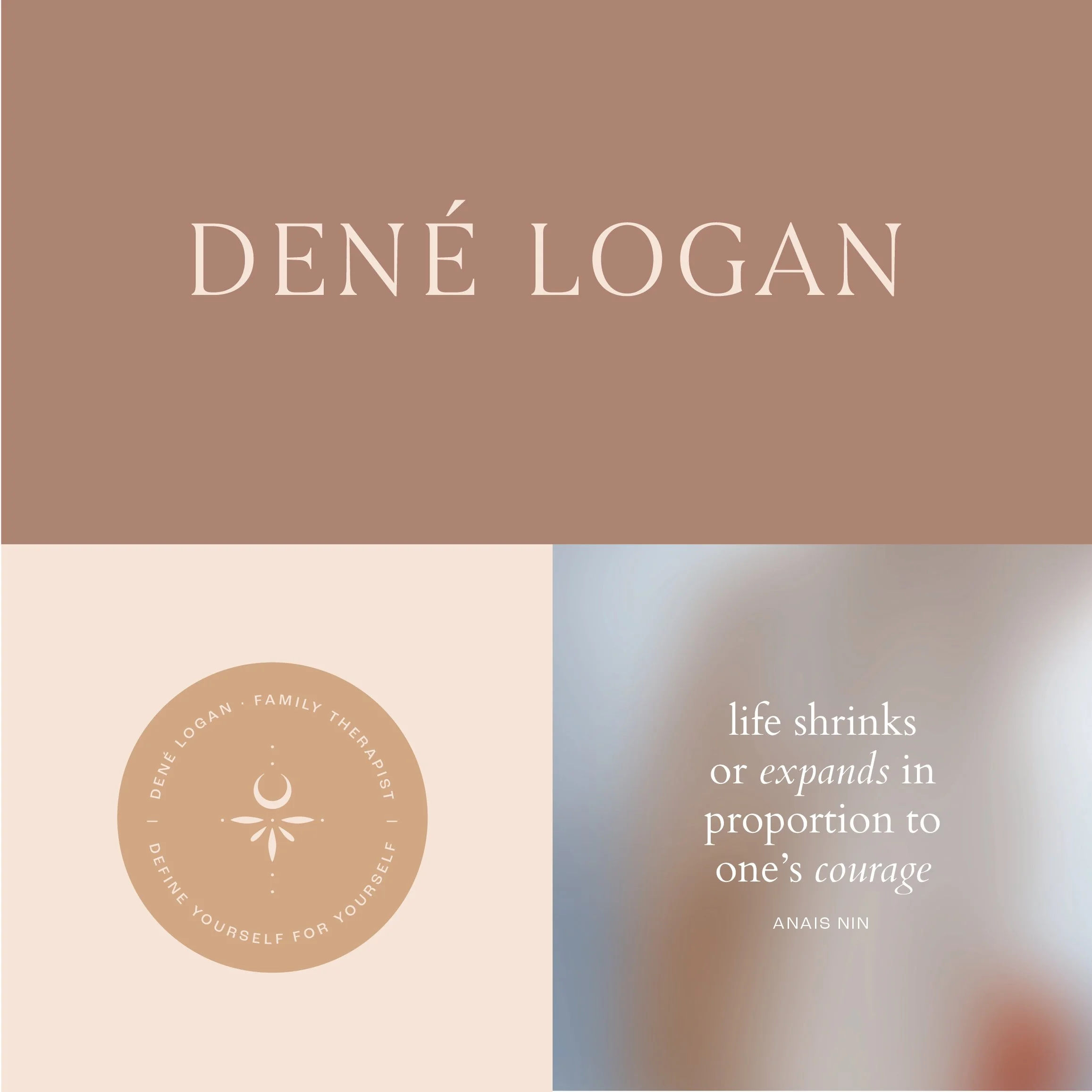
Dené Logan - Depth Therapist, Author and Facilitator
About the Business: Dené Logan is a Marriage and Family Therapist, Group Facilitator, Author, and voracious Wisdom Seeker living in Los Angeles. She has been mentored by Esther Perel and her work helps others get in touch with the deeper layers of their (capital S) Selves.
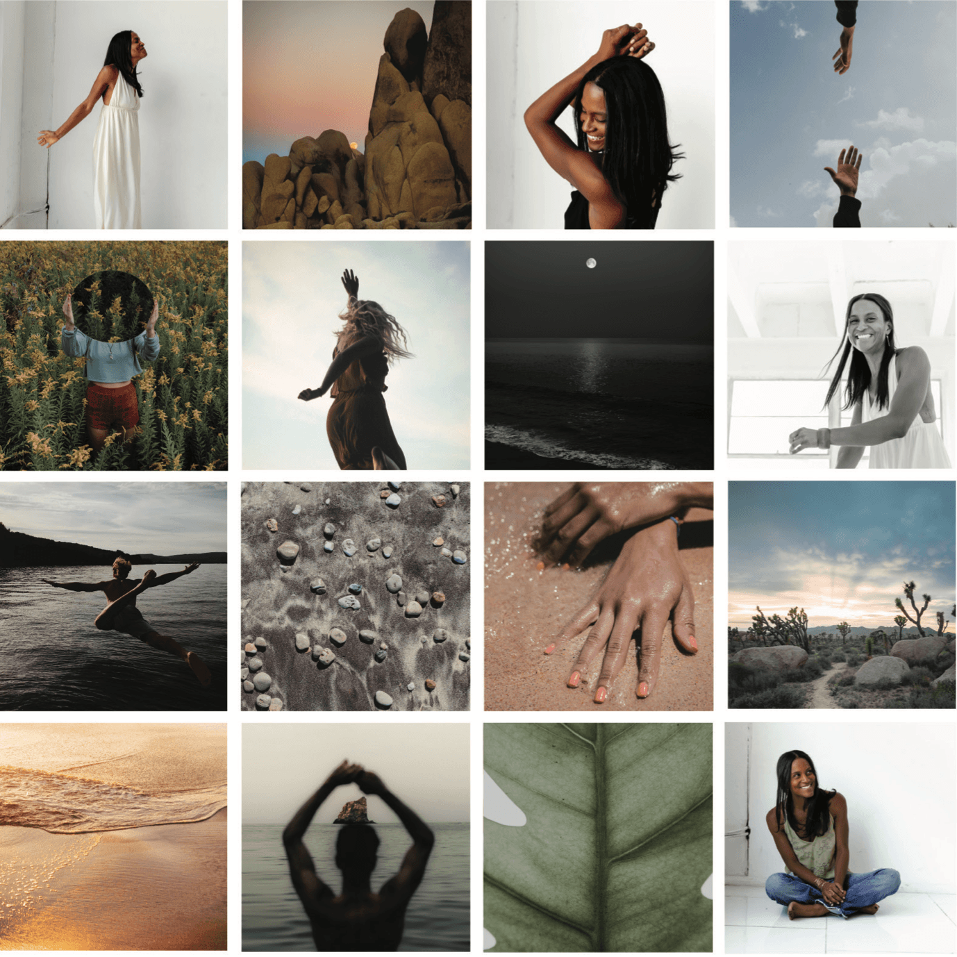
Logo and Brand Design Style Notes: Dené’s brand is poetic and editorial, with minimal copy, and dreamy imagery. We created an abstract, delicate mark that features the moon. The two primary objections were to exude both the strong, confident masculine energy and the receiving energy of the feminine. The tiny dots make the icon feel spiritual and ethereal to me, almost like light flickering.
Bold, colorful logo design and brand inspiration:
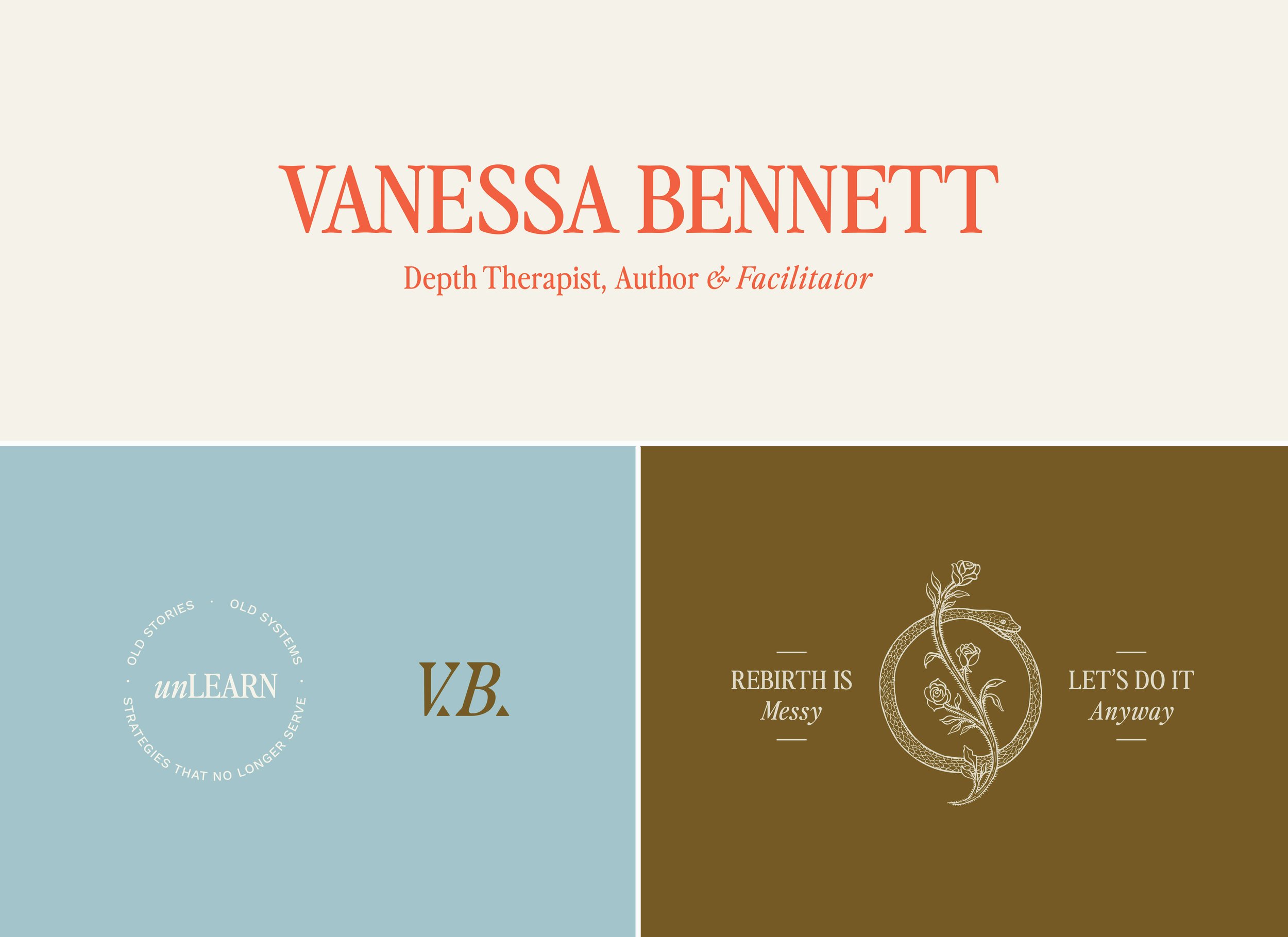
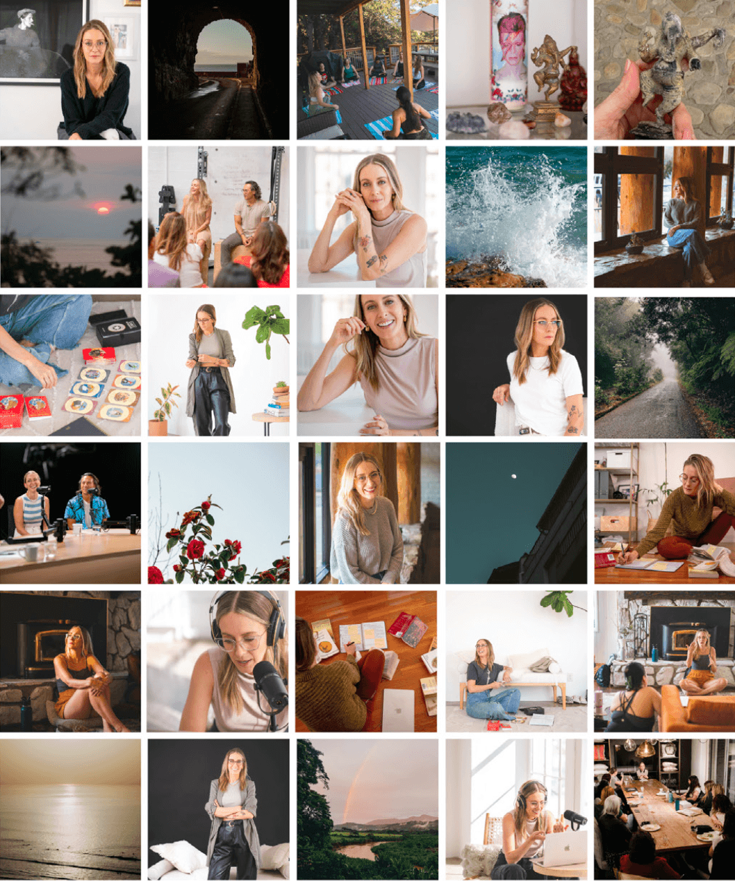
Vanessa Bennett - Depth Therapist, Author, Facilitator
About the Business: Vanessa Bennett is a licensed depth psychotherapist, author, and facilitator helping people break cycles of self-abandonment, navigate codependency recovery, and reconnect to who they are beneath their conditioning. Her work is rooted in depth psychology, archetypal exploration, and embodied healing. Where ancestral wounds meet modern healing, and the Self is remembered, not built.
Logo and Brand Design Style Notes: Vanessa’s site feels bold with pops of coral red and deep magentas, angular shapes, and dynamic scrolling. A surprise snake illustration in the footer adds a personal and symbolic touch. The ouroboros is an ancient symbol of a snake eating it’s tail, representing the death and rebirth cycle, a theme that is deeply personal to Vanessa and her work in depth therapy.
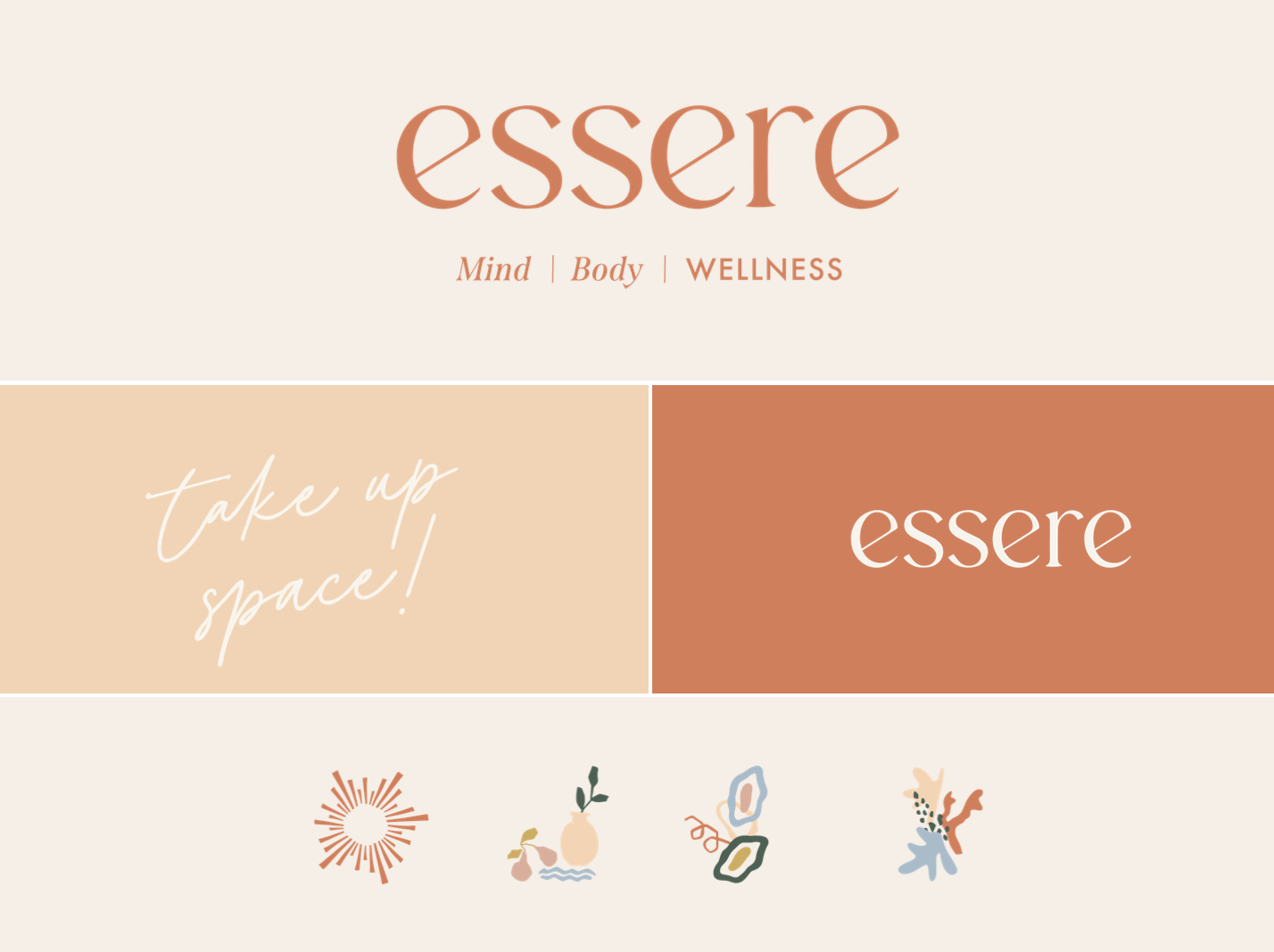
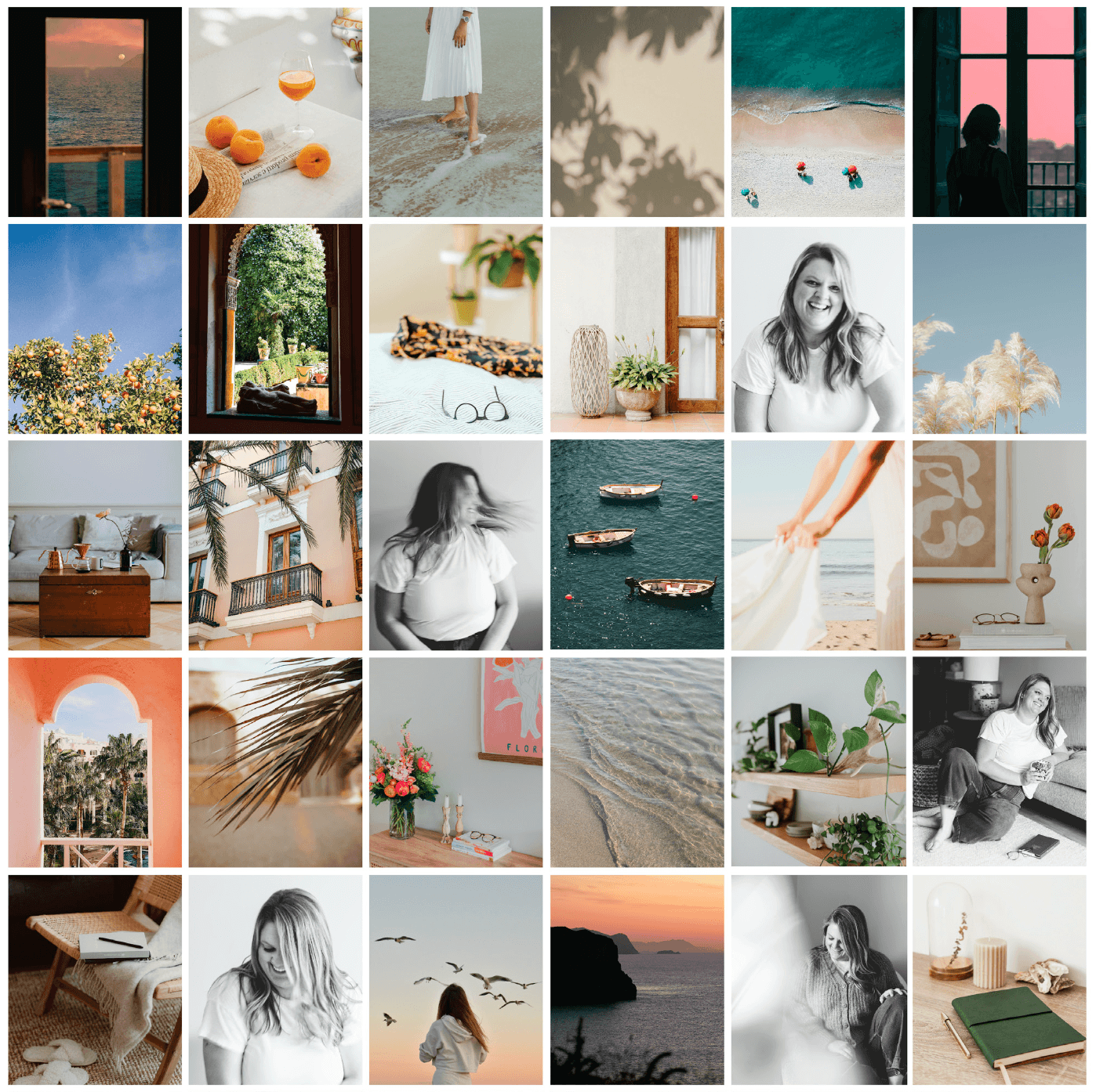
Essere Mental Wellness - Licensed Therapist and Body Image Expert
About the Business: Maddie is a licensed therapist based out of Virginia. She works alongside women as they release unhelpful narratives from their past, rewire with self-compassion, acceptance and understanding, and reenter as their best selves.
Logo and Brand Design Style Notes: Maddie’s brand feels like a Mediterranean vacation—bright, bold, and uplifting. Playful illustrations and sunny imagery of flowers, fruit, and the beach help the brand stand out in the therapy space. The logo is an all lowercase friendly sans serif with fun angles on those “e”s, which creates a welcoming feel.
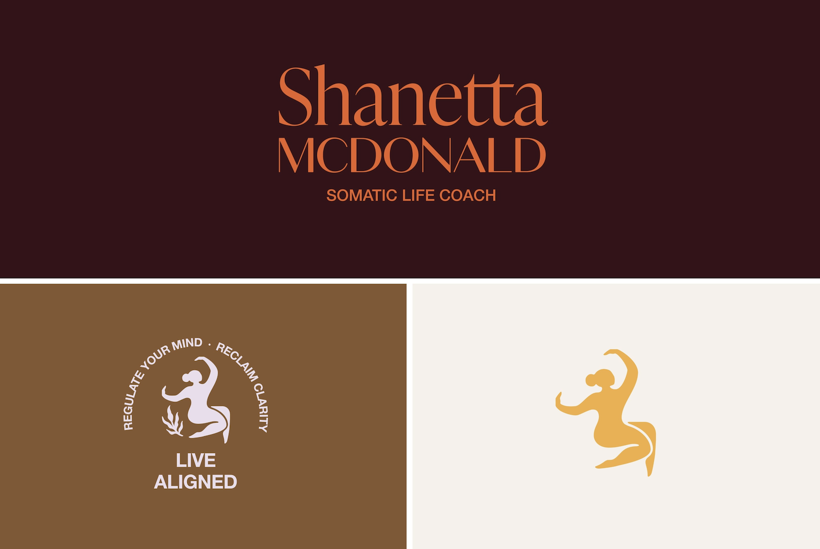
Shanetta McDonald - Somatic Life Coach and Podcaster
About the Business: Shanetta McDonald is a somatic life coach, helping women who want to release stress, reconnect with their bodies and reconnect with themselves. She is a Wayfinder Coach in-Training with an MA in Communications and BA in Business Management and Marketing.
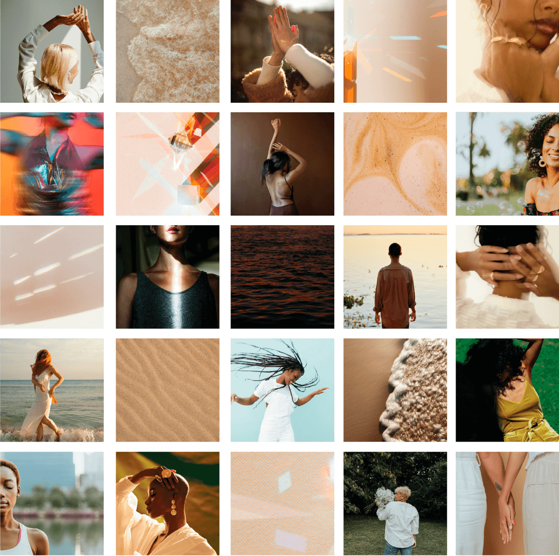
Logo and Brand Design Style Notes: Shanetta’s brand stands out with bold colors, deep browns, and a signature mustard yellow. The striking angles in her photography add uniqueness and movement to the site. For the submark logo we have illustrated a woman that’s dancing and moving to embody somatic work and a general sense of aliveness. In addition to the illustrated woman we are also featuring a sprig of greenery to quickly convey a sense of wellness and peace.
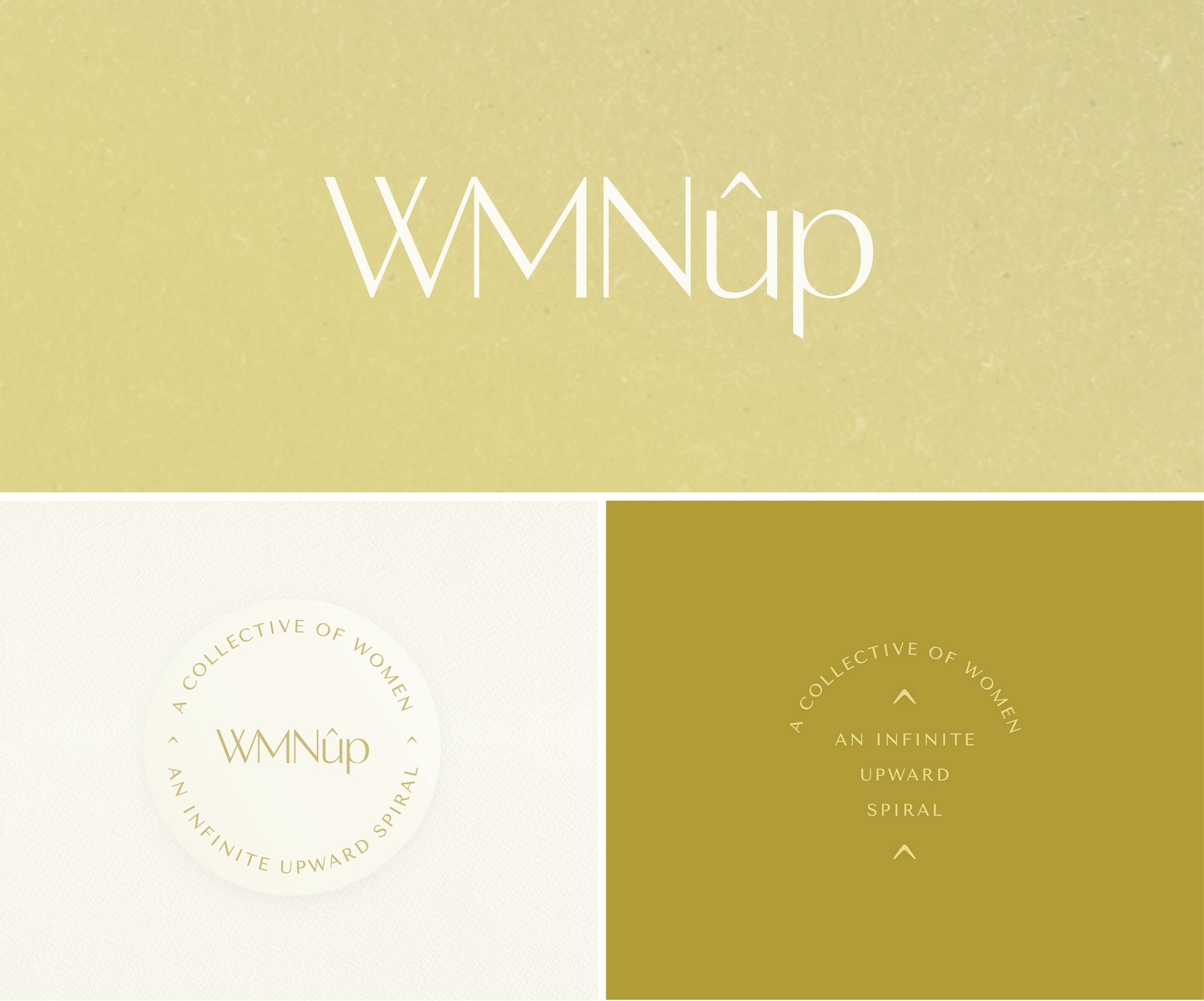

WMNup - Business Coach and Leadership Consulting
About the Business: WMNup offers intentional business and leadership consulting for mission-driven women visionaries, innovators, and change-makers ready to build a regenerative high-impact business. WMNup is a community led by the founder, Emily Cassel. With a background in soulful strategy, evolutionary leadership, and community-powered growth, she’s dedicated her life to helping women rise—on their own terms, in their full expression, and without compromising their joy.
Logo and Brand Design Style Notes: Emily’s brand is strikingly minmal, using sharp typographic treatments for her logo and main tagline / message submark that feels feminine and direct. The site pairs vintage imagery from the women’s rights movement with photos of the WMNup community. This contrast creates an energizing, empowering, and connected feel.
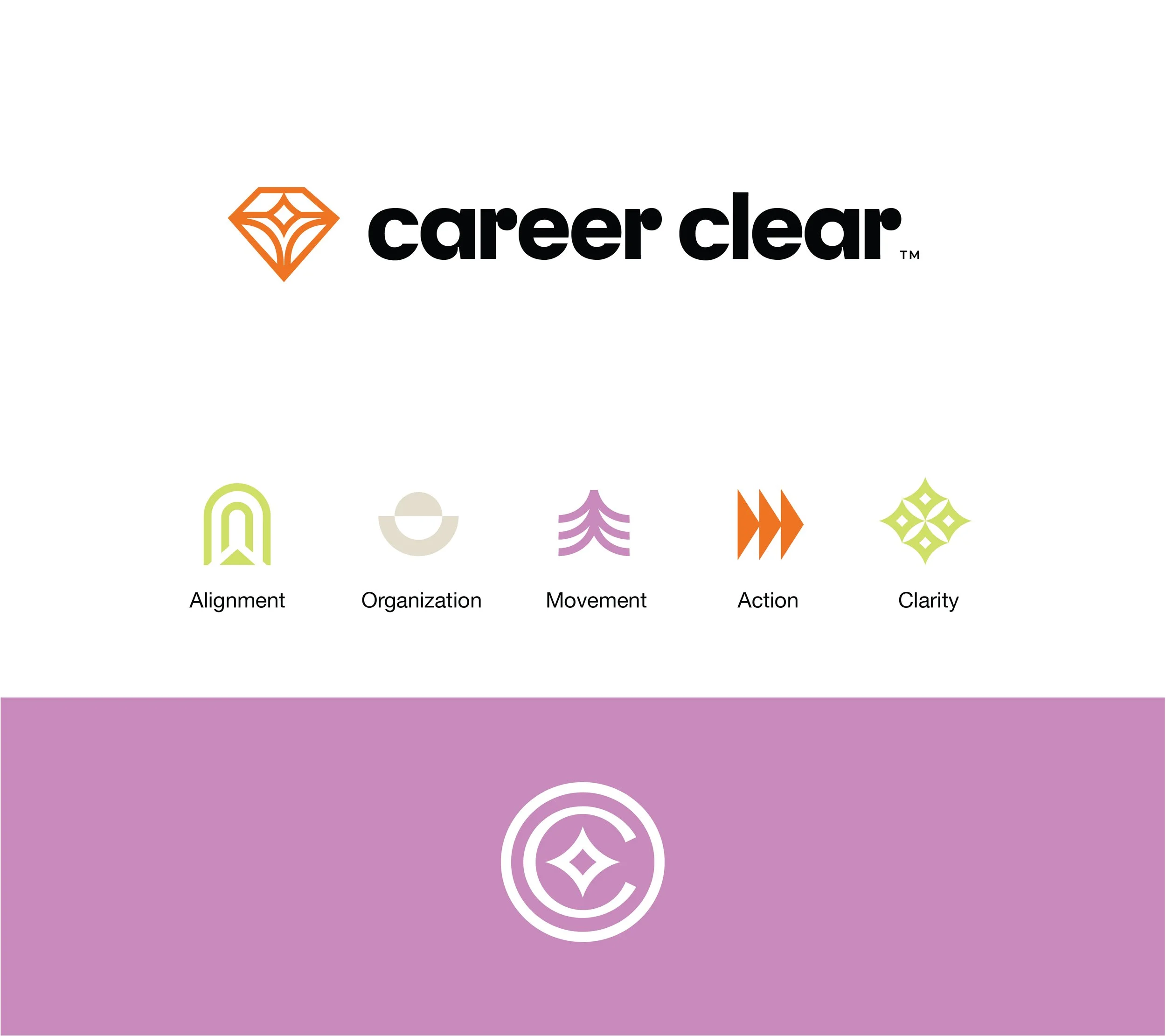

Career Clear - Career Coaching for Tech Professionals
About the Business: Career Clear supports high-achieving professionals in the tech space to lead with confidence and clarity—optimizing their communication, presence, and influence through a balance of inner alignment and strategic execution.
Logo and Brand Design Style Notes: We created a clean, geometric, symmetrical diamond for the primary logo. A diamond naturally has a high-end feel and it’s known for that “crystal clarity”. We then created bright, bold, colorful icons for her core business values in an illustration style that matched that diamond.
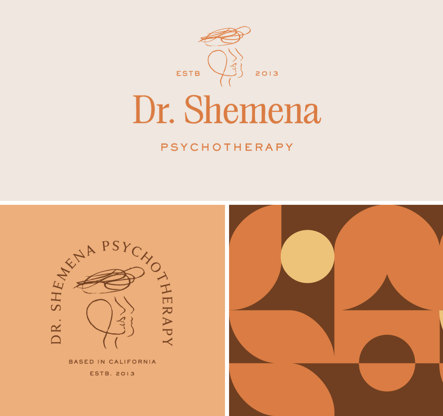
Dr Shemena Johnson - Therapist in California
About the Business: Dr. Shemena Johnson is a Licensed Marriage and Family Therapist based out of Los Angeles who helps adults and couples navigate the complexities of anxiety, depression, trauma, life transitions, and relationship challenges.
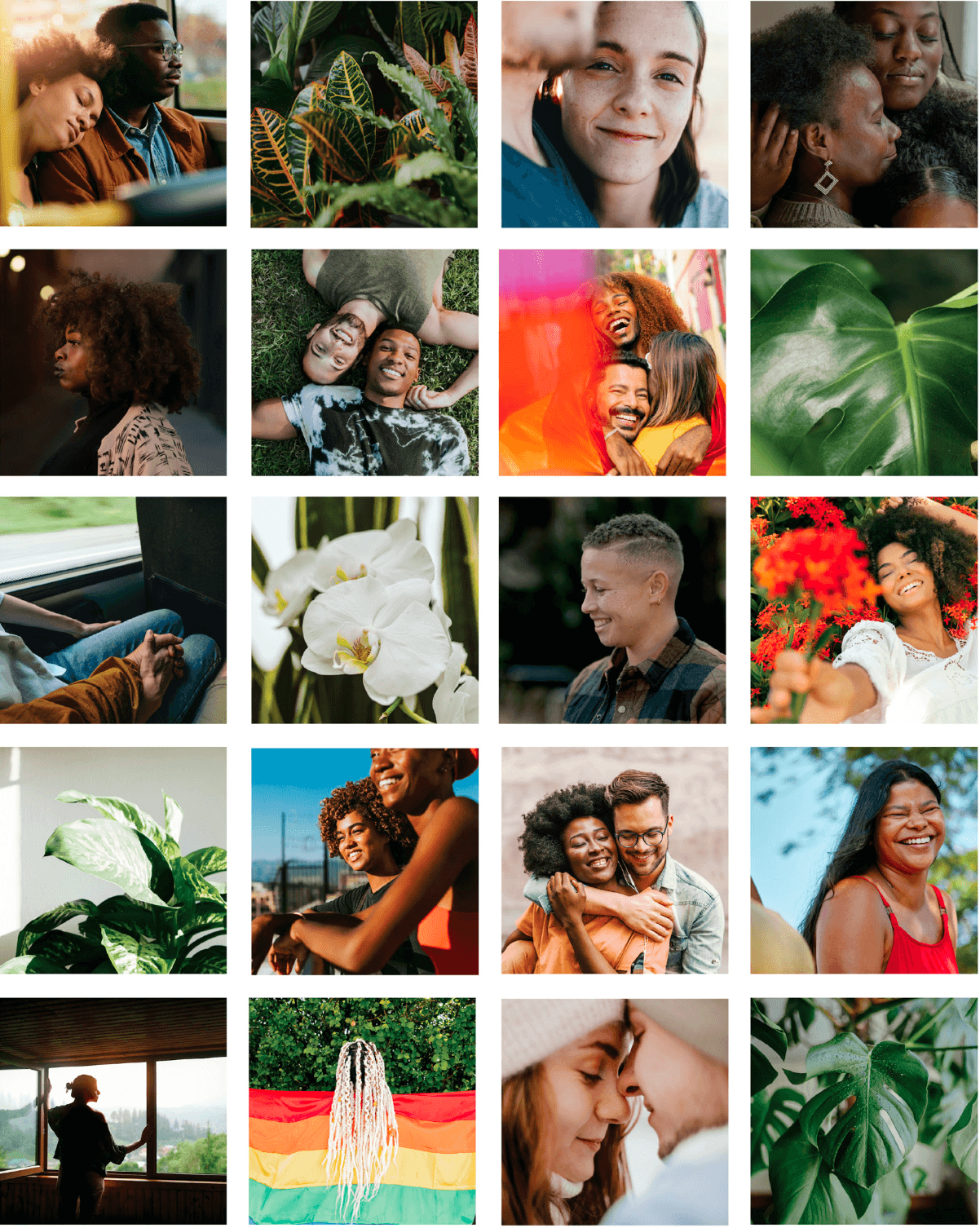
Logo and Brand Design Style Notes: Shemena’s branding as a whole is warm and colorful using plenty of browns, oranges, and peach tones. It was important to reflect inclusivity within her brand stock imagery and the feelings of joy, fulfillment and happiness. For her primary logo we illustrated two heads (a couple, if you will) with an intertwining thought bubble “knot” as a brain. This is often the feeling prior to therapy; a tangled knot that needs to be worked through.
Feminine, soft logo design and brand inspiration:
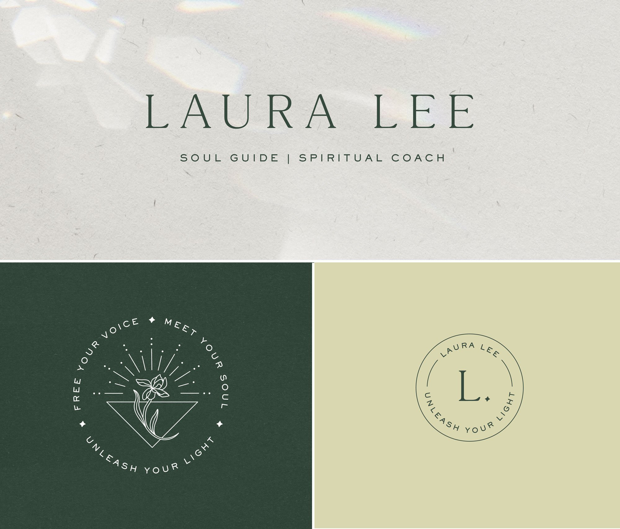
Laura Lee - Soul Guide and Spiritual Coach
About the Business: For over 10 years, Laura has supported coaches, creatives, entrepreneurs, doctors, empaths, mothers, artists, and heart-led leaders to unhook from self-doubt, liberate their true voice, and unleash their gifts in the world. She leads women from all over the world in 1-1 soul immersions, coaching containers, intimate retreats, and group programs.
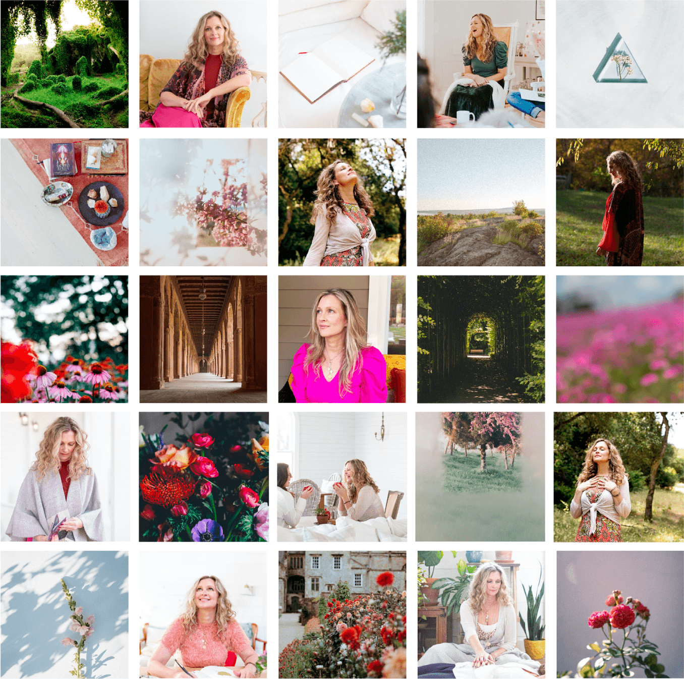
Logo and Brand Design Style Notes: Laura’s brand features organic textures and a rainbow light effect which makes Laura’s brand and site feel soulful, artistic, and deeply feminine. Her primary image mark within the logo is an iris flower opening on top of a balanced triangle with sparkles of sunlight reflecting upwards. The iris means “rainbow” in greek, and symbolizes hope, wisdom and trust.
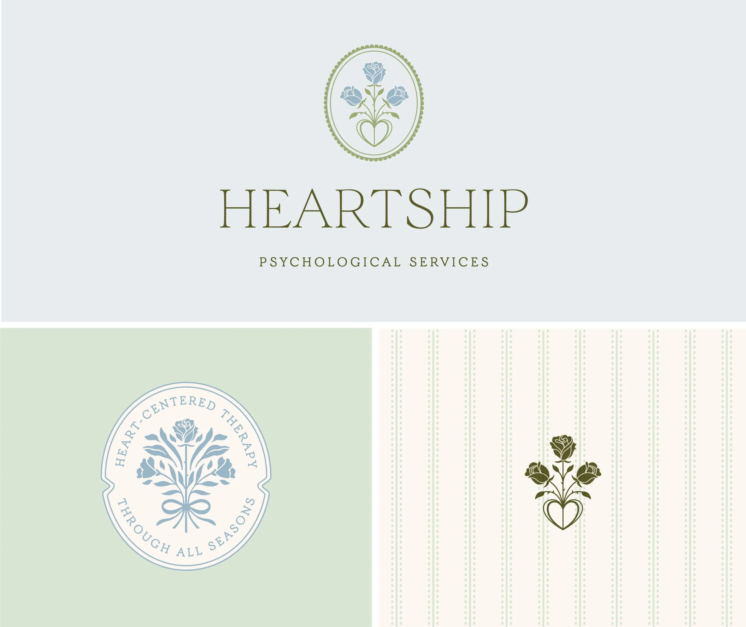
Heartship Psychological Services - Private Practice from Dr. Lauren Cook
About the Business: Heartship is located in Pasadena, CA and is a group therapy practice that is made up of licensed psychologists and therapists as well as supervised clinicians with advanced training in evidence-based approaches. They bring diverse clinical backgrounds and experience working with clients across a wide range of life stages, including professionals, parents, and individuals navigating major change.
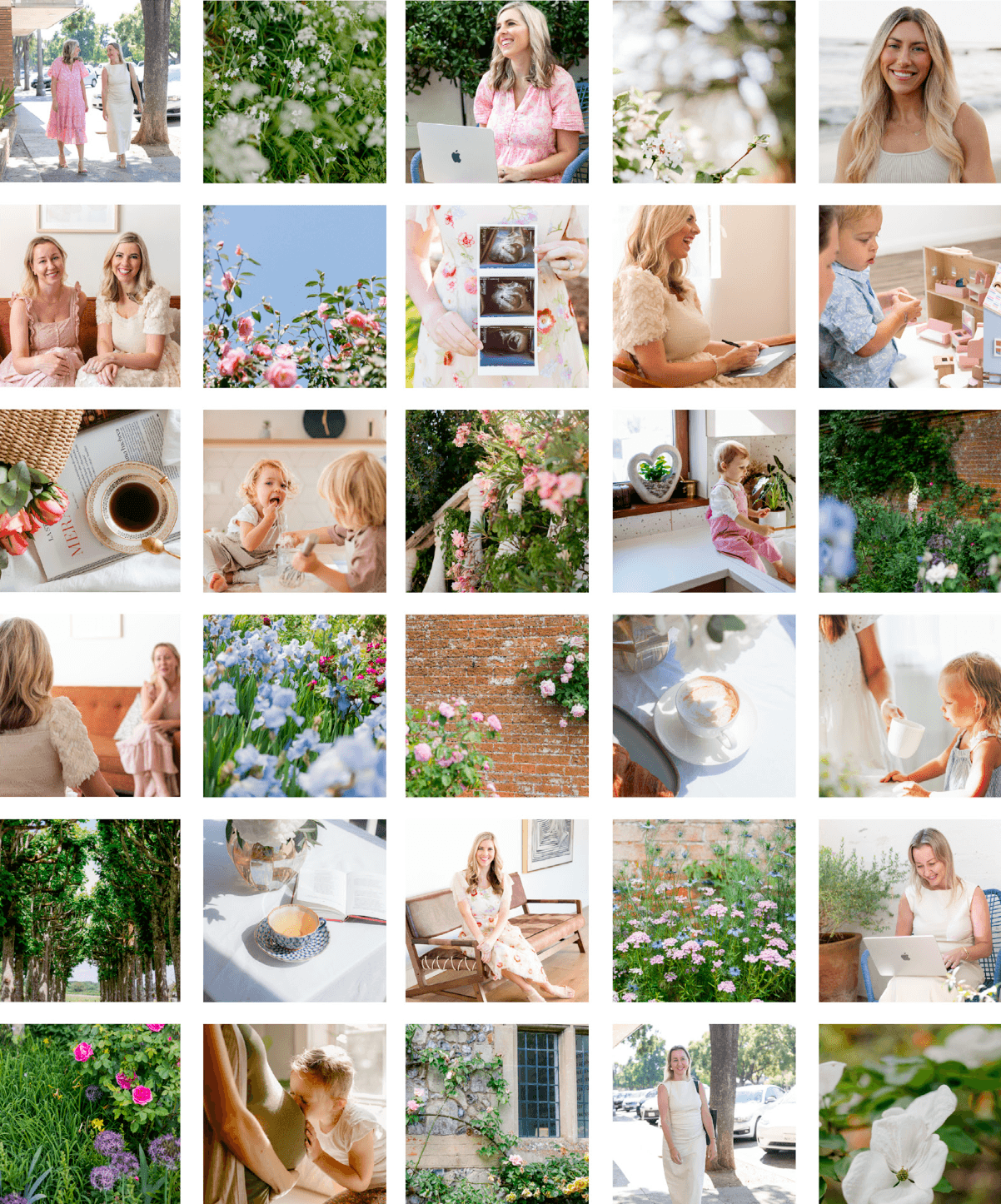
Logo and Brand Design Style Notes: Dr. Lauren Cook reached out in hopes of creating a different type of therapy brand—one that is unapologetically warm, feminine and inspired by the Nancy Meyers aesthetic. Located in Pasadena, the home of Father of the Bride, we leaned heavily on the icons of the region; Pasadena is actually known as the City of Roses. It hosts of tournament of roses, and hosts the Rose Bowl. Heartship offers in-person therapy and is deeply connected to the local community, so this strategy make a lot of sense for the brand.
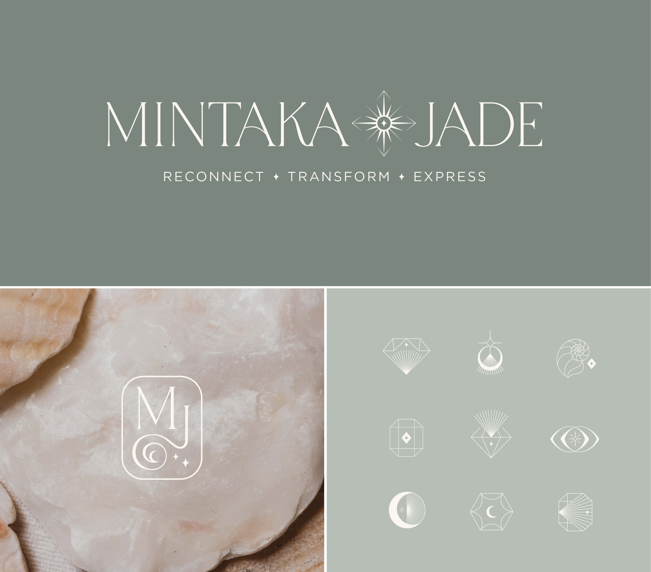
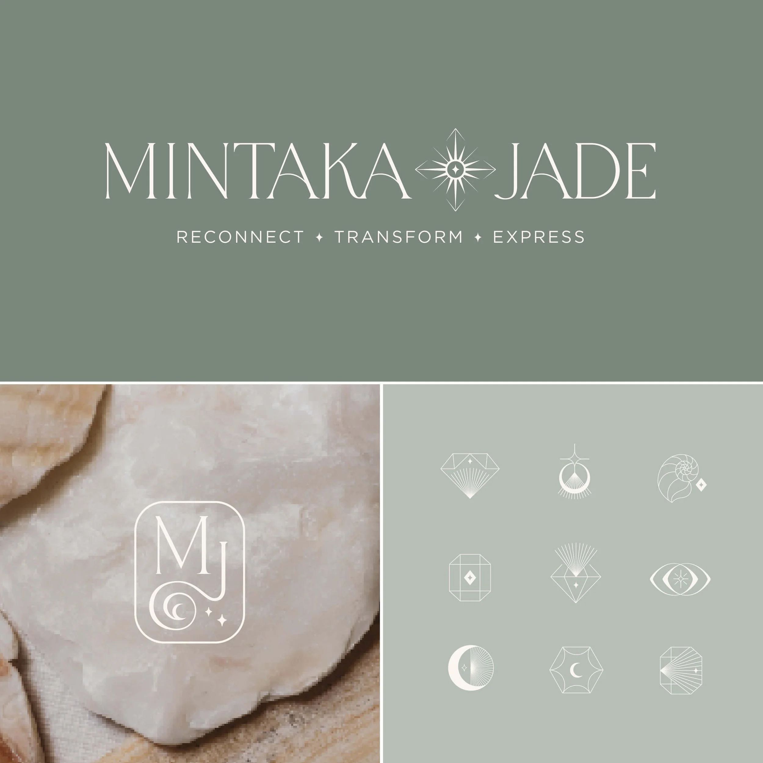
Mintaka Jade - Kundalini Yoga Instructor and Breathwork Facilitator
About the Business: Mintaka Jade was created by Maria Jose. Maria is a certified Kundalini Yoga teacher, personal stylist, and somatic practitioner. She guides people to let go of the "I'm fine" mask and return to their true selves. Her work is for those who appear serene, capable, and successful on the outside, but feel disconnected, exhausted, or never enough on the inside.
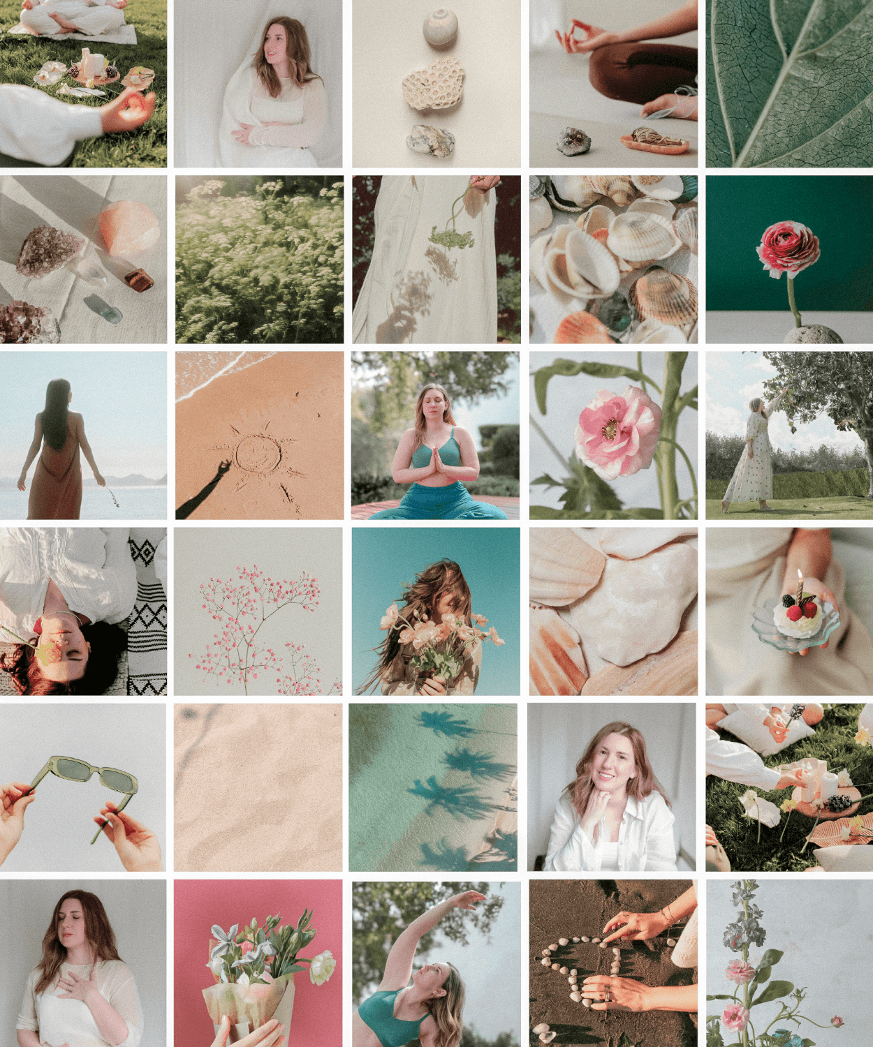
Logo and Brand Design Style Notes: The Mintaka Jade brand was deeply inspired by the breath. The flow and lightness of air. We also connected to Maria’s personal ties to the beach, the water, the sand, the sparkle and iridescence of seashells. Her primary logo image mark is a sparkling sun inside of a compass, symbolizing inner knowing and purpose. Her icon set includes that same small sparkle intertwined, featuring additional symbols of the moon, symmetry, seashells, eyes, and geometric abstract shapes.
Website coming soon!
Dessa Rose - Business Strategist and Coach
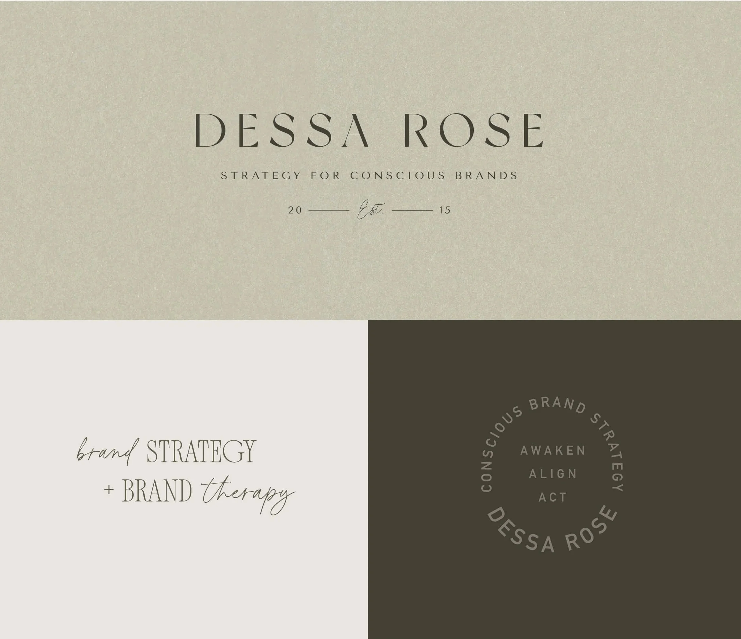
About the Business: Dessa is a a heart-led strategist and coach who works with women. She helps conscious brands and founders align before they act to find more grounded ease as they grow. In doing so, she helps businesses increase revenue, pivot offerings, and show up consistently and authentically in their marketing.
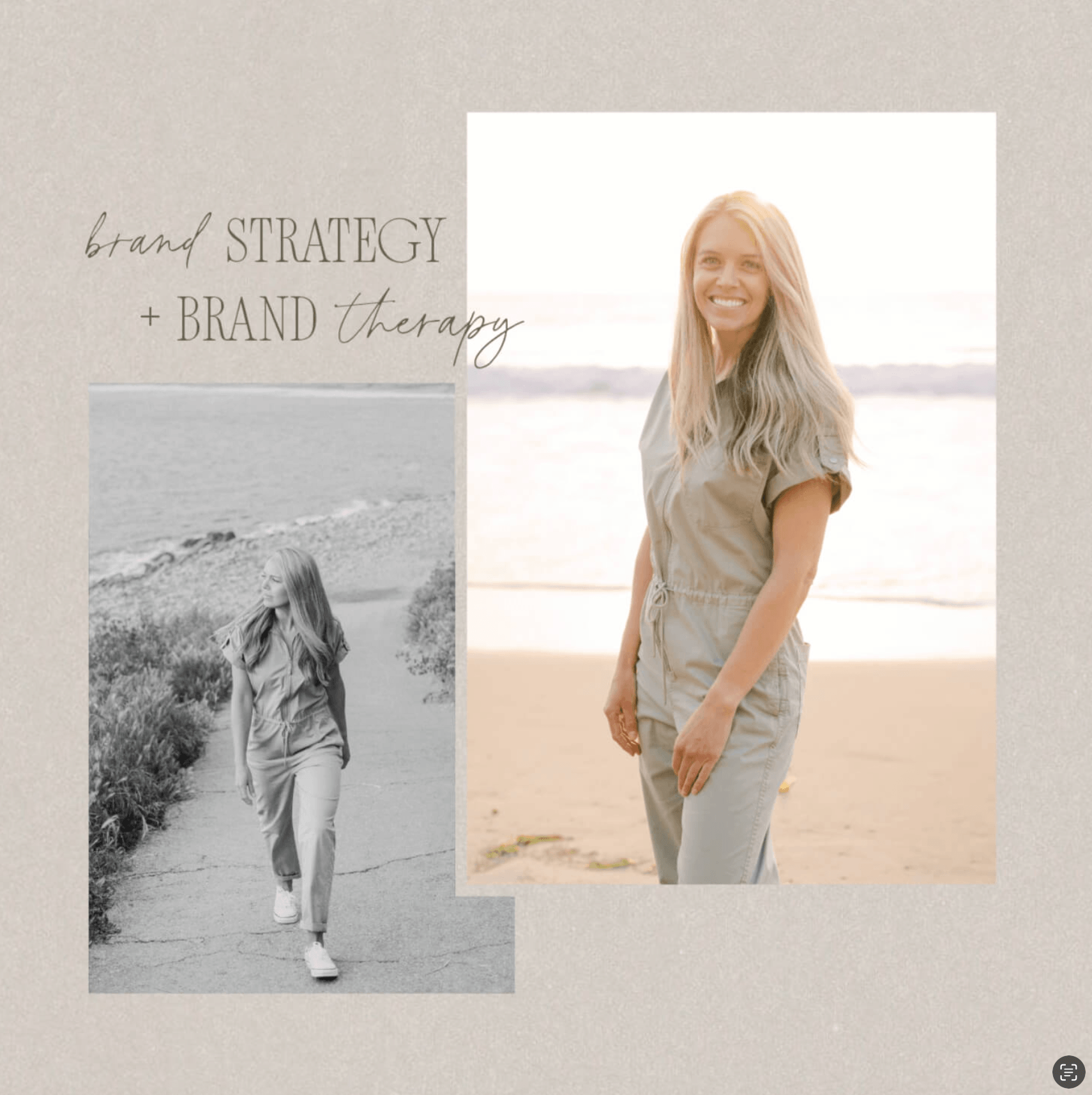
Logo and Brand Design Style Notes: Dessa’s brand features a sage green and gray palette that’s balanced by photography filled with wildflowers and sunsets, creating a soft, feminine tone without relying on (just) pink.
Dark, magical, mystical logo design and brand inspiration:
Christie Sara - Empowerment Coach
About the Business: Christie Sara is a Feminine Empowerment Coach who helps women move through big life transitions through coaching. Christie works out of southern California.
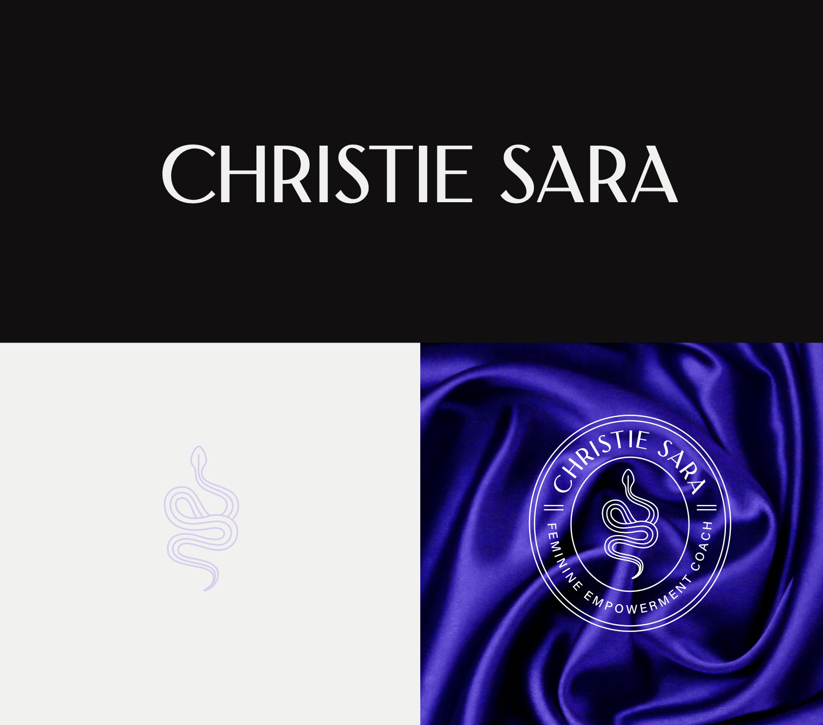
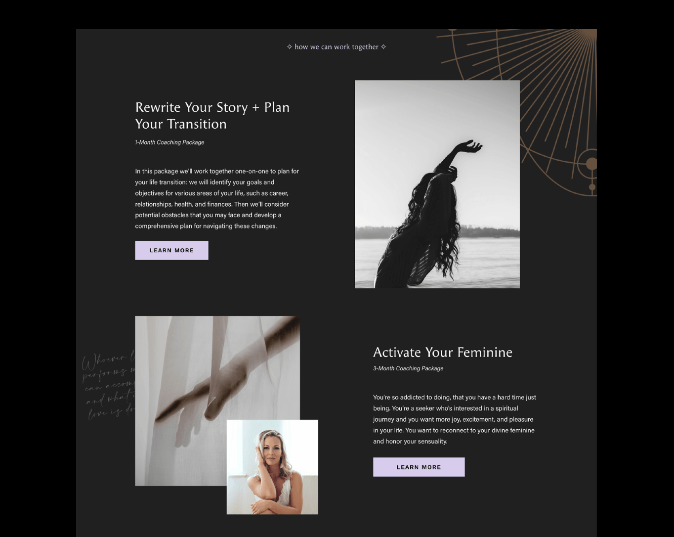
Logo and Brand Design Style Notes: Dark and mystical, the brand features a palette of charcoal, purples, and soft neutrals. Black-and-white photography and sensory imagery—feathers, sheer curtains, snakes—bring in depth and emotion.
This project has been archived.
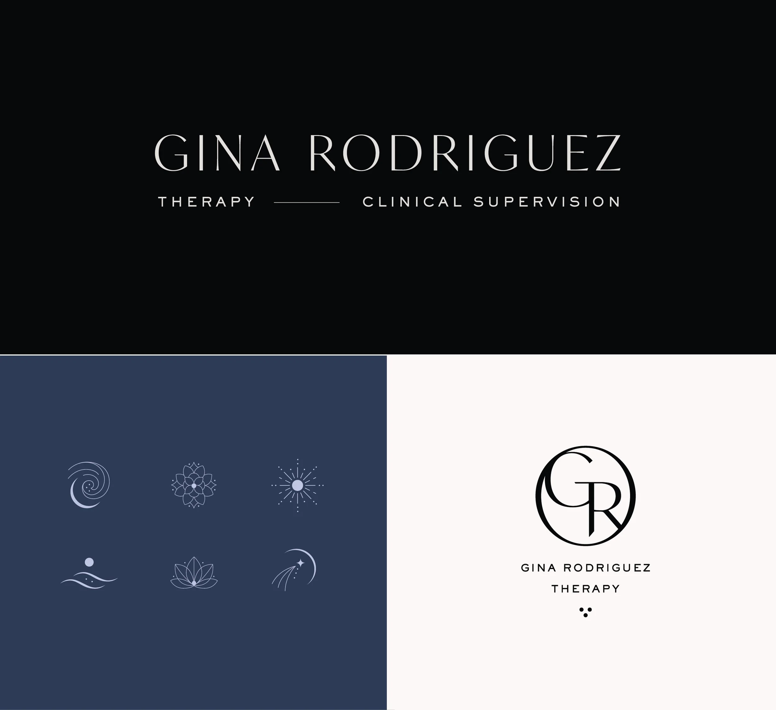
Gina Rodriguez - Licensed Therapist in Austin, Texas
About the Business: Gina is a Dual-Licensed Therapist and Clinical Supervisor that specializes in anxiety and relationship therapy. She is a Licensed Professional Counselor Supervisor, Licensed Marriage and Family Therapist Supervisor, and Somatic Experiencing Practitioner based in Austin, Texas.
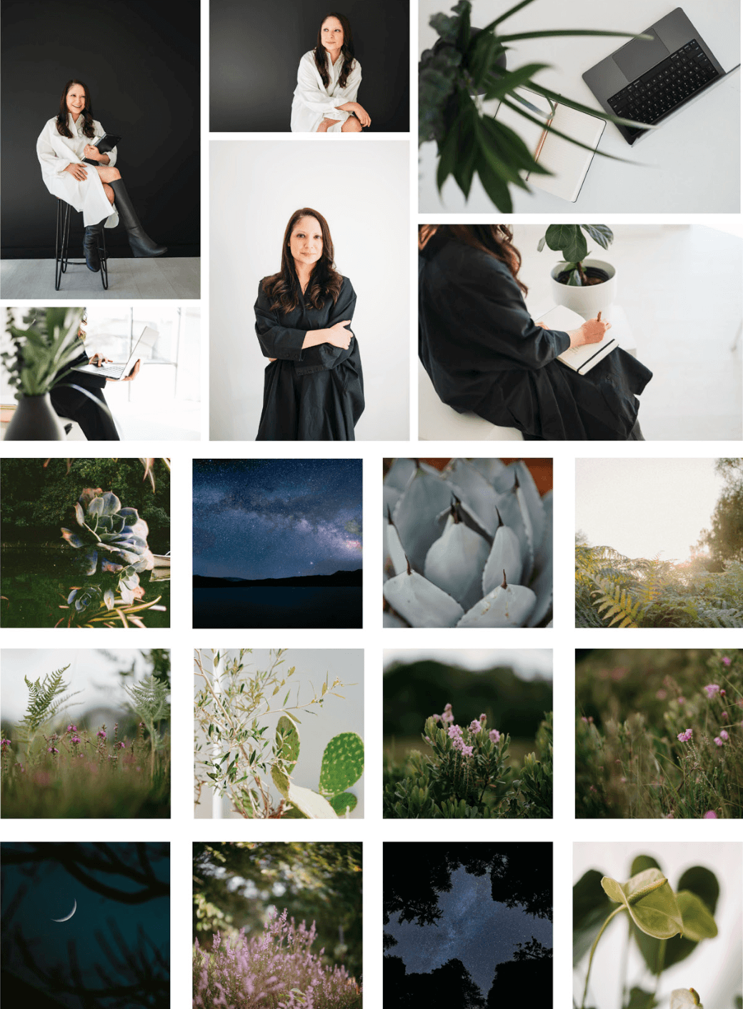
Logo and Brand Design Style Notes: Gina loves the color black and shared early on that she often wears black dresses. We knew immediately that we wanted the brand to feel premium, dark, and a touch spiritual using imagery of the night sky, and stars. We created a monogram for the brand—a symbol that is instantly seen as high-end and trustworthy, which reflects her education and years of experience.
Simple, inviting, clean logo design and brand inspiration:
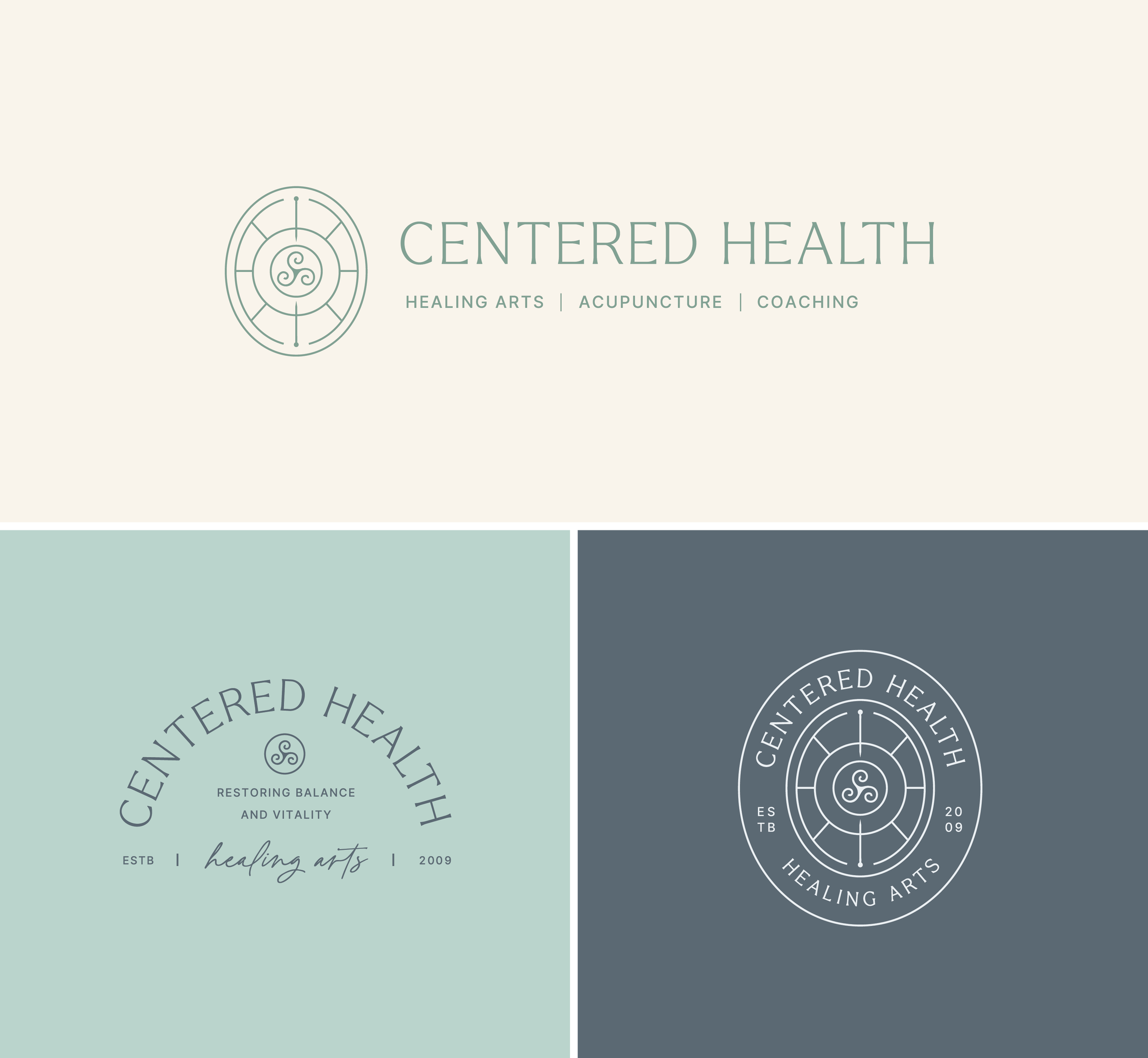
Centered Health - Acupuncture and Healing Arts
About the Business: Centered Health Healing Arts offers holistic care to address the root causes of physical, emotional, and energetic imbalances. Through acupuncture, bioenergetic testing, nutrition, herbs, and mind-body coaching, they help you restore balance, relieve pain, and achieve lasting wellness. Andrea is the founder and she’s assembled an incredible team. They serve clients virtually and in-person at their office located in Poughkeepsie, NY.
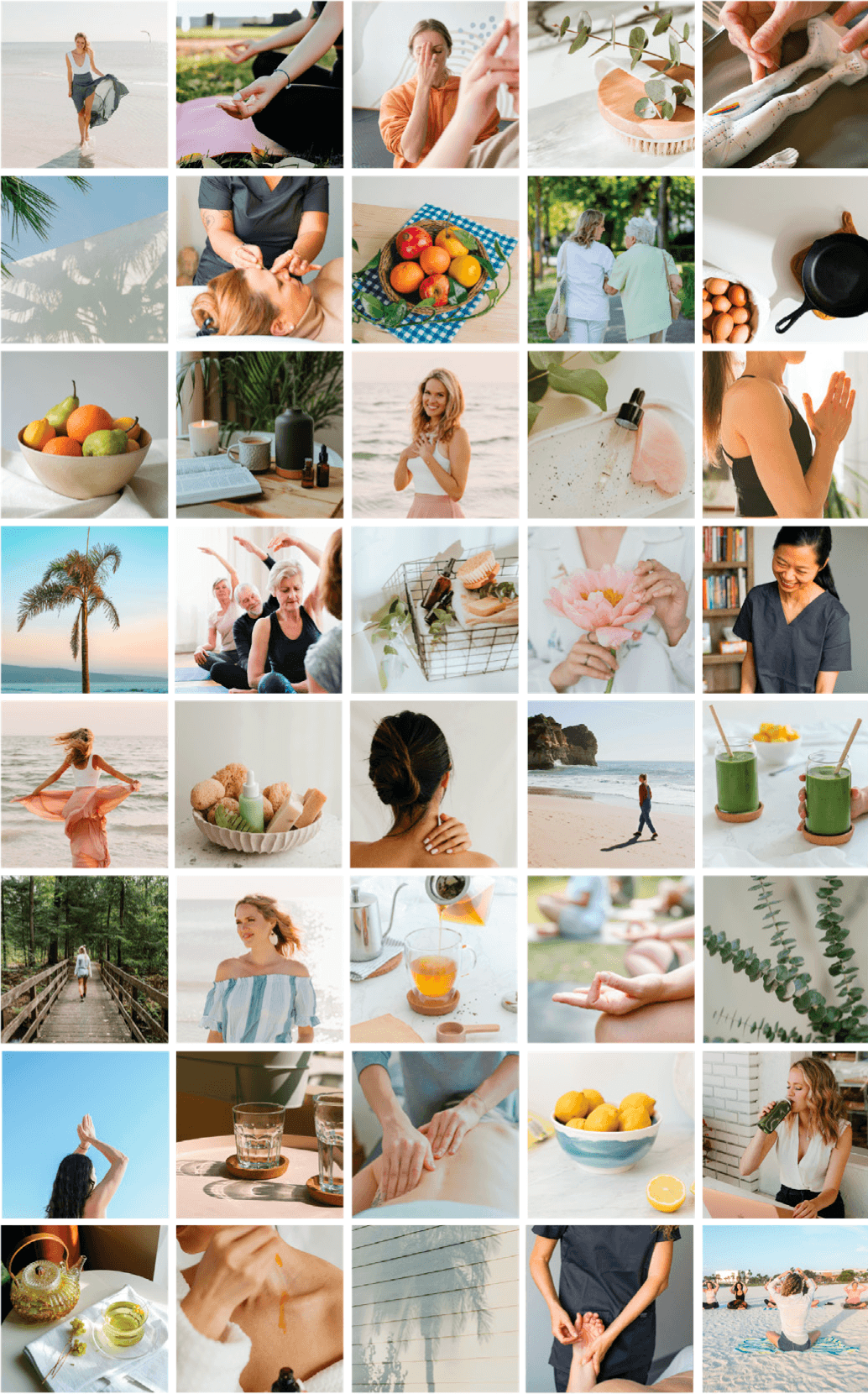
Logo and Brand Design Style Notes: With a spa-like feel, the branding uses soft colors, airy white space, and lightweight typography to create a calm, clean experience. For the primary image mark we’re featuring a 3-pronged spiral (a triskele) that represents mind-body-spirit. Outside of our swirling symbol we have symmetrical linework radiating out and two acupuncture needles pointing in, targeting that “mind-body-spirit” balance and harmony.
Alex Schrum - Licensed Therapist in Virginia
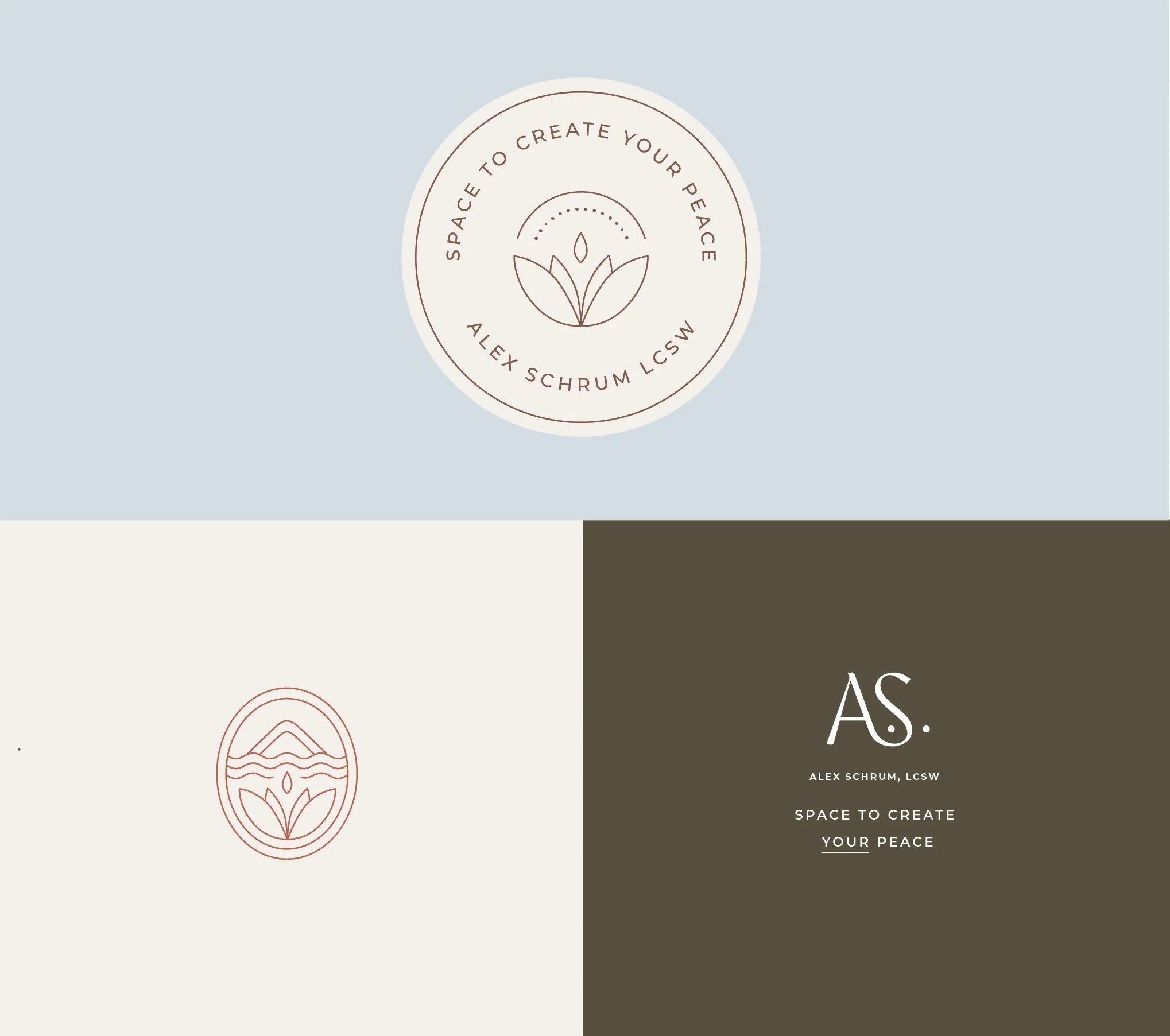
About the Business: Alex Schrum is a licensed psychotherapist based out of Richmond, Virginia. She helps adults who have experienced trauma in close relationships break free from the grip of shame and self-criticism. She helps them make lasting change and show up as their full, authentic selves. She also incorporated yin yoga within her sessions, which is incredible.
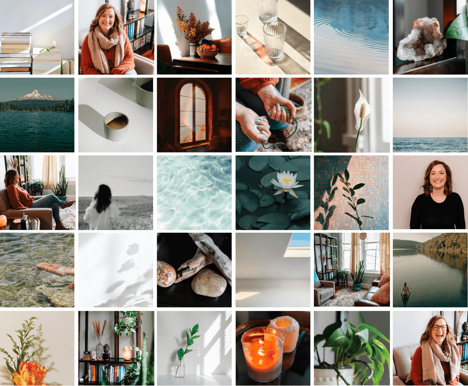
Logo and Brand Design Style Notes: Alex’s brand is simple, clear and uses soothing imagery to create a calm, grounded feel. For her primary image mark in her logo we illustrated a lotus flower, a symbol of personal importance to her, and a mountain scape in the distance (symbolic of the Blue Ridge Mountain region, which is where she is located).
Alondra Reign - Therapist, Author, Creative & Travel Photographer
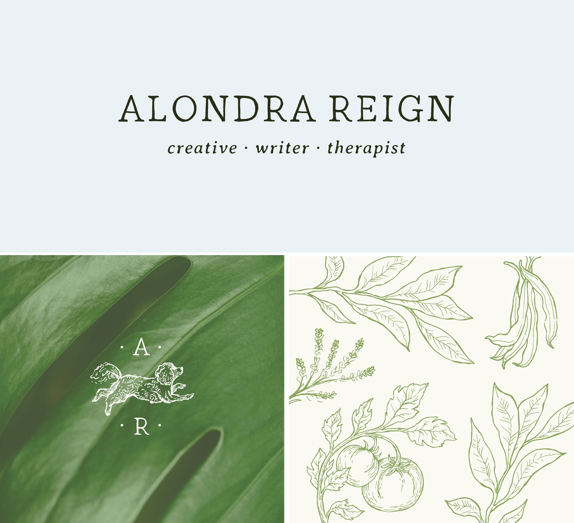
About the Business: Alondra is a therapist based in southern California, a photographer, writer, and lifelong learner. She helps people wake up the parts of themselves they’ve learned to put to rest. Through therapy and creative work she helps them turn hard-to-name feelings into something they can actually see.
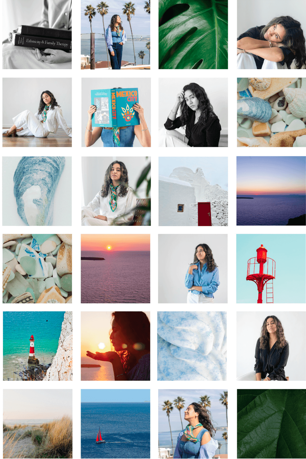
Logo and Brand Design Style Notes: Alondra’s brand is bright, hopeful and joyful while also still remaining soothing and a soft place to land. Her brand illustrations are hand drawn and touch on the different foods and flavors she experiences in her travels. Her “AR” monogram joyfully features her own little white dog - A personal tie that will forever be meaningful. The dog itself is also excited, curious and exploring - an overarching theme in her work.
Website coming soon!
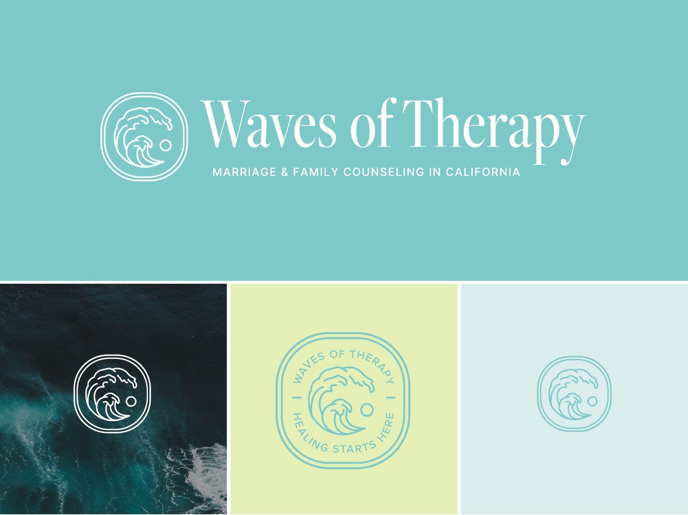
Waves of Therapy - Licensed Therapist in San Diego, California
About the Business: Deema Kanbaragha is a Licensed Therapist located in California. Her approach is grounded in empathy, cultural sensitivity, and a genuine commitment to helping you achieve the life you desire. With experience across various therapeutic modalities, she gently guides you toward healing and growth in a safe, supportive environment.
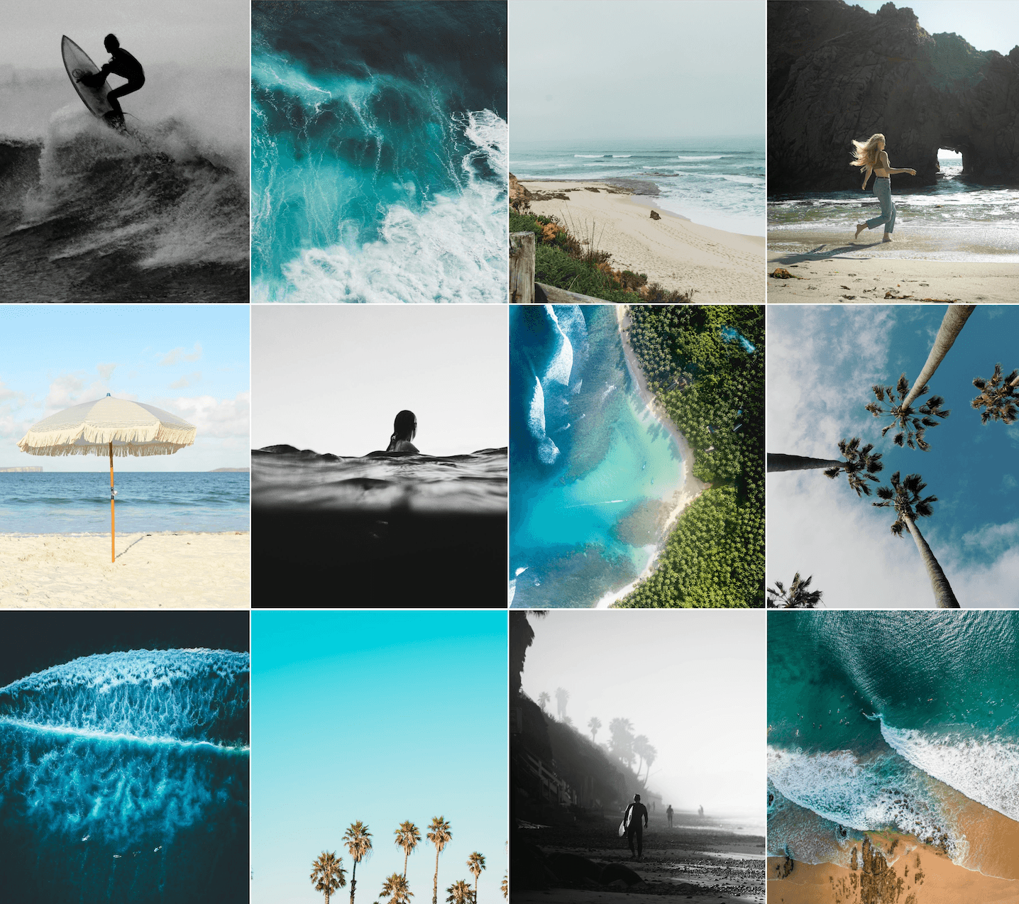
Logo and Brand Design Style Notes: Deema’s brand is inspired deeply by the ocean and her passion for surfing and the symbolism waves have when it comes to going with the flow and riding the waves of healing.
This project has been archived
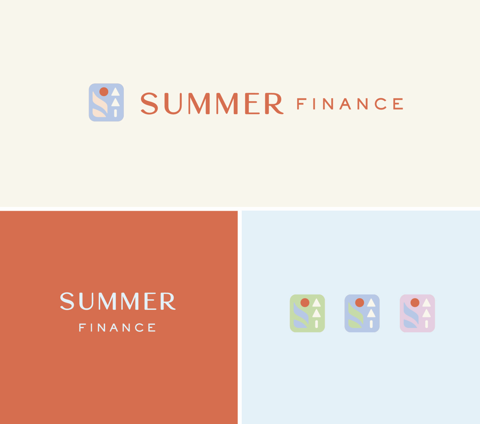
Summer Finance - Fractional CFO, based in the New England area
About the Business: Tiffany is a Fractional CFO for small businesses and startups and she is based in the New England are. She offers 1:1 support with CEOs offering financial support, and big picture thinking and strategic coaching for increased profit, growing a team and prep for tax time.
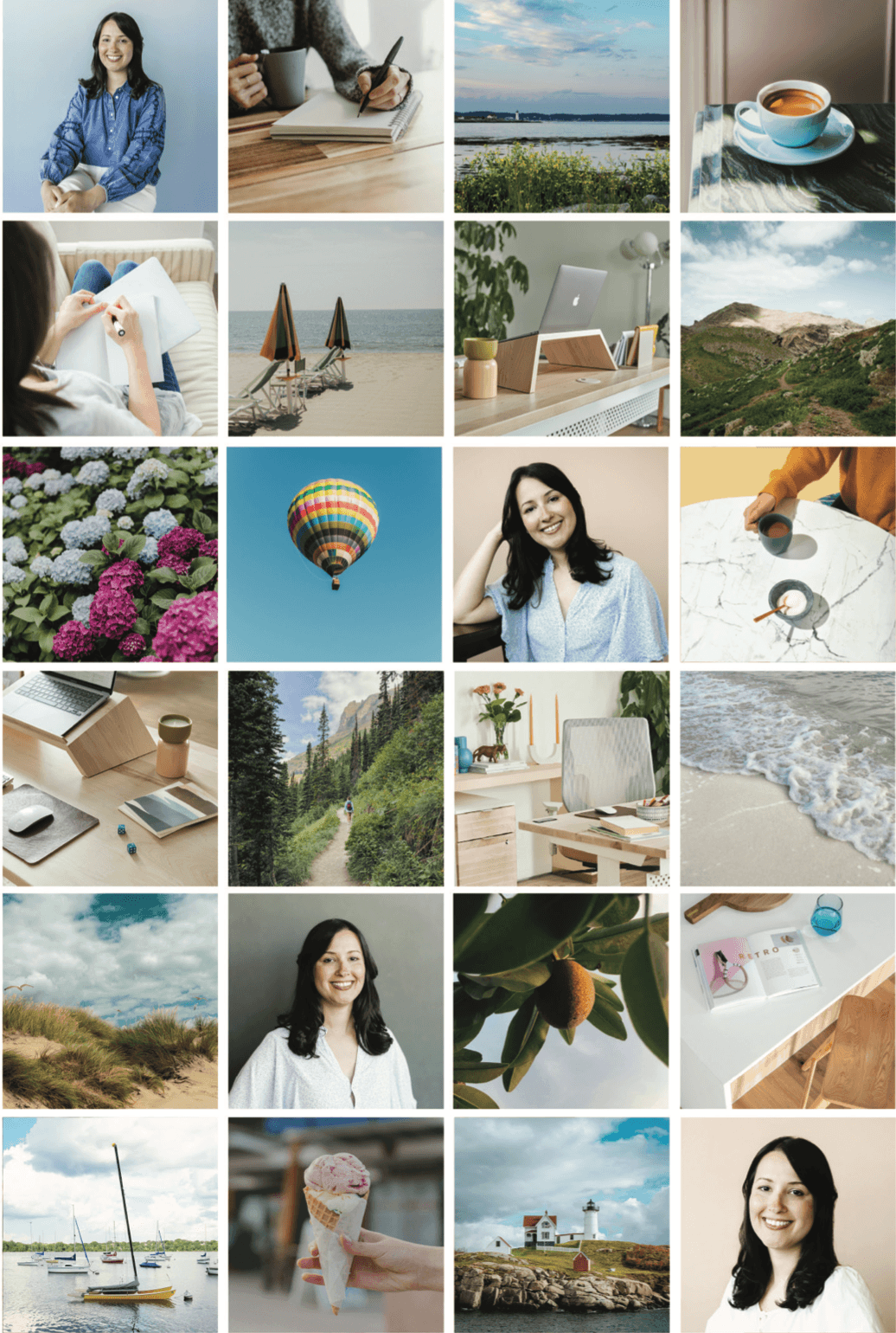
Logo and Brand Design Style Notes: For the primary logo icon I had three goals: 1. Create a feeling of upward positive momentum (shown in the flowing graph trending upwards and the upward pointing arrows). 2. Utilize simple, minimal shapes to convey ease and warmth. 3. Allude to a Summer Day - a scene from a hike (you can see the arrows make up a pine tree and the flowing graph is like a hill or mountain and then of course the sun is out int he top right corner).
This project has been archived
Here at Sundai Studio a well-designed brand does two things: it embodies your unique energy and it builds trust with your community. It attracts aligned clients and helps them feel connected to you right from the start.
I hope these 25+ brand and logo design examples inspire your next steps and help you see how design can align with your purpose, values, preferences and style. If you're ready for a strategic, intuitive brand that supports your business growth, I’d love to connect.
👉 Explore Sundai Studio's website design services or get in touch to start your project.

That’s it! Whether you’re a client reading this or you’re someone on the internet looking for some guidance, I hope this blogpost feels supportive for wherever you are in the process.
If we haven’t met yet, I’m Jena Thielges a Brand and Website Designer. I specialize in working with women who are coaches, therapists, healers and service providers. Founded in 2019 on seven years of agency experience, Sundai Studio is more than a brand and web design studio—it’s your energy, embodied in design. Because even your branding should feel aligned.
Check out my offers here and get in touch if you’re ready to book a free consult call!
Y O U M A Y A L S O E N J O Y …